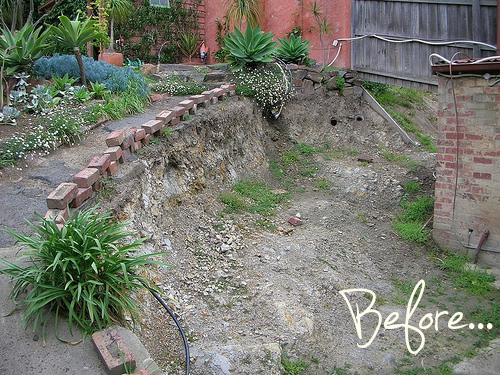
This is an undoubtedly complicated site, but this before and after makes a stunning transformation. Greg Hatton designed and built this garden. I am personally taking inspiration from the beautifully rustic and aged looking (but brand new) handrail and cable railing as well as the fearlessness to soften the paving with plating in the corners. I find so often that we can get blinded by the beauty, expense and perfectionism of paving and hardscaping and forget that it actually looks better when plants soften edges and it is a little less than perfect.
What inspires you in this garden transformation?
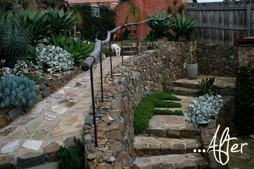
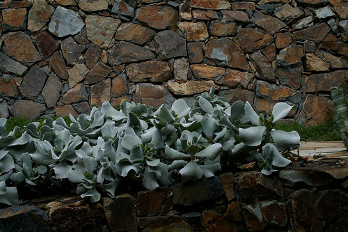
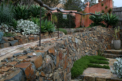
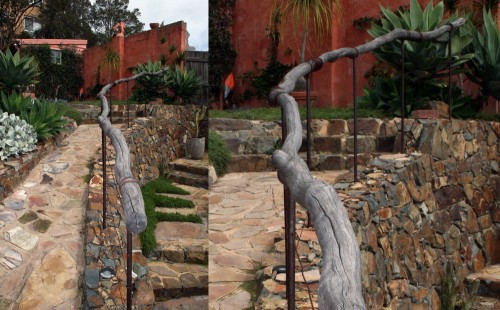
I love the way the colors repeat – the grey and terra cotta structure behind are tied into the rock color, and then the grey plants and the grey railing are marvelous. It is a large swath of rock, which is actually quite reasonable for the area (I’m guessing between Texas and CA). I like the related but slightly different texture of the underfoot paving (with sand grout) v the tight pack wall paving. The wall is a large presence, but it relates to the rest instead of overwhelming the rest. The context is honored.