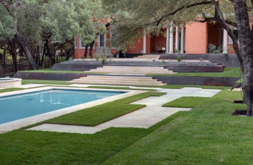
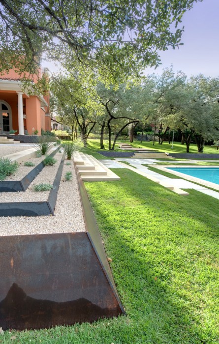
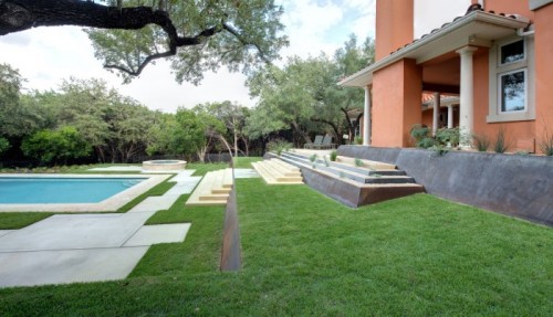
Today’s garden has me conflicted. I am a fan of interesting and novel design. I’m also a fan of technically well executed work. But while I can appreciate some of what makes this garden, I don’t have a love of the whole space.

To me it doesn’t fit, it’s quirky off-centerness is cool, but in context, nonsensical. And the materials don’t fit. And there is just so much hardscaping! And I really miss having plants. I think they might make the whole thing more appropriate.
If I were brought in to work on this garden, I might make myself the challenge of not changing the hardscaping too much but instead making it appropriate, and beautiful with just an updating or addition of plants. What do you think of this place? If you love it, I’d like to hear why, but if you don’t I am curious what you might do to fix it on a budget?


design by D-Crain
I love the hardscape…if it were a modern house..It feels disconnected with the architecture of the house, but I agree, more plantings could make it feel more harmonious in its contrasts. (More) Grasses tall and short spring to mind to keep it modern, yet soften the edges…and I do love those steel edges. Maybe it just needs a couple of years of growth?
too much grass- the turf doesnt really define the hardscape- while i like the clean edges of the steel I would use groundcover other than turf. Varied texture and color foliage. and maybe in mind with the environmental conditions. That turf looks really thirsty….also, the tiers dont really look very useful for gathering or enjoying the space around the pool. Hmmmmm…
I dig the walls, though I feel that the way the stairs were integrated into them was not very well thought out or refined. The hardscape around the pool is awkward at best, and feels like it is trying too hard to be different. I agree it lacks vegetation. The middle terraced planter near the house could be really cool if it were planted well. The spa seems lost and out of place. Probably not D-Crain’s best work.
yeah Modfrugal — I thought that it may just be that it needs to grow in a bit too…I’d love to see how it is in a few years. — but I think it still will probably need more vegetation of the non turf (I agree w/ you too louise) variety.
Agreed josh — check out d-crains website….lots of other projects that I think are much more successful.
It looks incomplete, like there should be urns filled with plants in some of those pushed out spots in the concrete, perhaps a bench in the larger space. And the terraces need either no plants in them or more- with so few it looks like they are weeds the gardener missed.
First thought was that those stairs are downright dangerous to anyone using them dripping wet after a dip in the pool. Simple, low profile railing(s) needed, either one down center of steps or one on either side ending in a gentle curve. That chimmney wall bothers me. Needs either an evergreen espalier or a low hung, well designed sculpture on it to ground everything and stop the eye which is presently overpowered with upright height. This landscape design is a piece of sculpture unto itself. Plants may not be necessary. But, more horizontal sculpture is needed. This design does not look finished to me.
I agree – the sparse grass looks like weeds. It should either be a lush full row of maiden grass, or something else entirely. Then some round terra cotta pots in a color similar to the house, places in the corners to make more sense of the odd shaped paving by the pool, and tie the color back to the house. Maybe a pair of aqua blue urns on the top tier, to relate the blue of the pool.
This design is completely out of line with the architecture of the house. The columns under the portico, the roof tiles, the arched windows, and the paint color of the house should be changed to reflect a post-modern aesthetic. I realize this is not a low budget option.
On a Iow budget, I would incorporate some large classical or tuscan urns throughout the space and defintiely add billowy grasses and some softer plant materials around the hardscape to make it easier on the eyes, which would hopefully make the house seem more in tune w/ the landscape.
Another aspect I don’t like about this design are the corten steel terraces. They are too industrial and bulky in this application. Instead, how nice it would have been to see the stairs softly melding into the hillside! The concrete around the pool is haphazard and trying too hard to be novel which makes me cringe. And the spa is random in placement, shape, and scale to the pool.
I realize this may seem harsh, but considering some of the other projects I saw by D-Crain, this one fall well below par.
Great content, amazing. Good job.