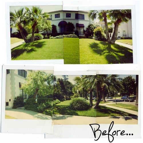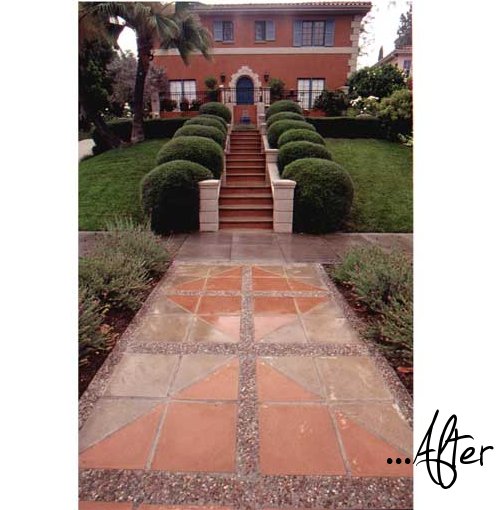
Pretty, but dated is what I think when I look at these before images. But the ‘After’ puts the shine on this property.
Ditching the awnings and adding the steps highlights the beautiful front door (in addition to being obviously functional). Of course, the details make it special, like the stone pattern in the walkway, the blue pot focal point and the symmetrical plantings. When I see a project like this, I always think of those makeover TV shows where they invest in the house for the sake of property value improvement and then at the end of the half hour, the realtor comes in and says what the new value is.
If I were the realtor, I think I would say that this project has increased the value of this house far more than the cost of the project (even though steps like that aren’t cheap and I know nothing about the local market). What do you think? Does this house look like it’s worth more after the redo?

Kudos on the Apartment Therapy gig! I actually had one of my design leads text me from her office, to check out the post, then she added that ” Oh, THAT lady, the only garden blogger I like!”. So, hey, they opinion makers like you too! Best of luck with the venture.
Matt
Are you sure you didn’t get the before and after pictures switched? The one labeled After is really ugly. I love the previous one labeled Before. Nice and green with a feeling of space. The second one is so uptight.
Wow, that is an amazing transformation. I always wonder how one gets a landscape to look established in such a short time (I think the answer is $$$), but this is impressive.