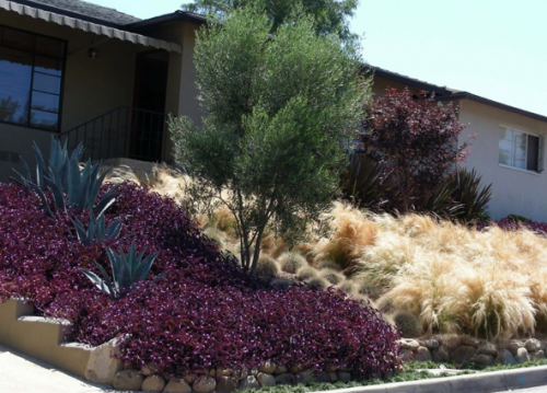
I am curious what you all think of this front garden. I think I really like, it is challenging, interesting, and unique and masses of hairlike grasses always make me happy. But I am also not sure that my own tastes tend towards the heaviness of deep burgundy under the California sun. Wine and Silver Blue — to me is meh — It’s a deeply personal color combination thing that I think is taking a little of shine off this for me. When you go this bold, the colors really have to work. Do you like these colors together?
Billy Goodnick designed this for artistic clients and I admire the bold choices in planting and the blocking. I think it is an effective way to make a small and simple plant palette come to life. What do you think?
What do I think? It looks like a garden for someone who really loves certain colors and plants. I too have had to design gardens around people’s choices and tastes, and am not always pleased with the results; however, there is great value in creating a space filled with what the owners love, rather than what is design-worthy. With that said, this is also a drought tolerant design, which gets many points. The agave provide texture and color, like staccatos across a melody. Finally, this design is low maintenance, which is also good for the owner. Great job giving someone exactly what they want!
Hear, Hear, Trampas….every gardens should be deeply personal and if the owner loves it, then it it is perfect.
I think it’s gorgeous too. Although I do wonder how it fits into the street, partly because my street is so monotonously lawn. I’m good with blue, cream and wine. Oddly the thing that doesn’t belong here to my eye is the green tree. It may tie into something that is out of the frame, but in this picture, it’s a plain jane on a glittering red carpet. Either dramatic foliage, like fig, or dramatic shape – those italian columnar conifers – or a repeat of existing colors – The local xeric equivalent of blue spruce? would be better. ok – try a blue spruce pruned into a four sided box sculpture echoing the house proportions. Food for thought, but I wouldn’t waste the water.
I am not a professional and If the client likes it, that’s great. But personally, I don’t care for the cream grasses. I would have gone with all wine grass and added plants that are green, blue green, silvery green and yellow green.
beautiful design! love the boldness and use of large plantings (blocking?). i just posted a review of a wonderful new book, called “tomorrow’s garden,” by martha stewart’s garden guru who offers ideas on how to create gardens similar to this one.
here’s the link if you’re interested: http://lagunadirt.blogspot.com/2011/04/tomorrows-garden-is-worth-visiting.html
The abrupt change in texture and color from the tradescantia to the stipa is too jarring in its straight downward hill demarkation. It looks bi-polar. A graceful textural weaving would have done this landscape wonders.
The agave americana planted in the swath of tradescantia is a nice combination alone, but when seen as a whole with the stipa , the entire design composition is compromised.
Using stipa tenuissima, AKA Mexican feather grass is an EXTREMELY invasive species grass in the Santa Barbara climate and is very frowned upon. In many areas of California with the same climate it has been banned and many forward thinking eco conscience nurseries no longer will sell it.
It establishes itself in the cracks of concrete, asphalt and has over taken areas of native eco-systems. I love this grass but it is just too aggressively invasive to used by any professional in the know in climates where it wrecks eco- havoc.
The repeat of the burgundy colored trees , up by the house is a nice attempt at harmony but the large blocky expanse of the stipa is so out of scale and predominate that it almost negates the repeat element effect. There are some individual elements within the design that are nice, but as a whole , it is heavy, blocky, and not environmentally considerate of the existing adjoining eco-system.