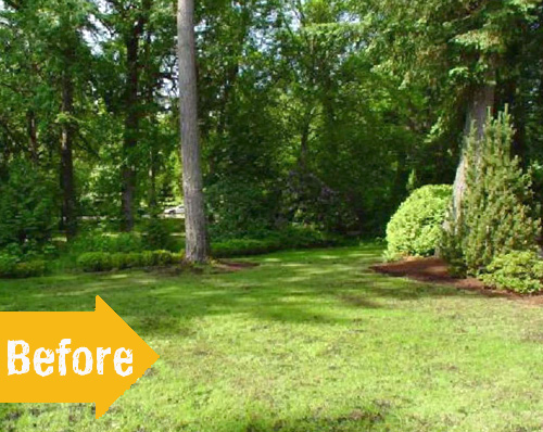
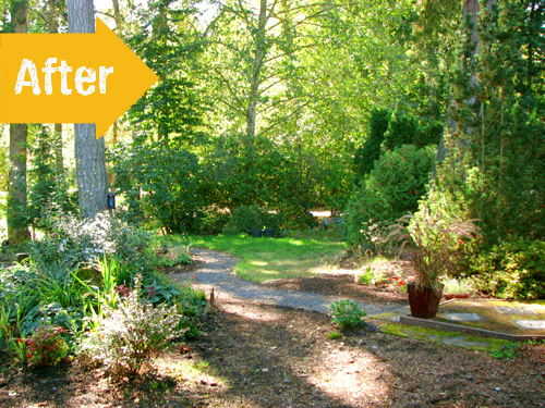
While I was rummaging throughout the depths of the internet for my next Before & After, I came across this photo and knew I had found the one. It reminded me of my own backyard; lots of mature trees at the edge of a grassy landscape bleached by sunlight. And since I’m on a constant “less grass, more shade” mission, probably brought forward by the horrid “group camp” scenarios I’ve encountered, I crossed my fingers that I’d find an after shot with a new space tucked within those trees.
And to my delight, I found just that. Less grass and a nice new hangout spot in the shade…perfect! I really like the new path and the additional section of mulch and plants, it makes the are look so much more inviting! Nice job, Terry! Oh, and the rest of Terry’s yard is pretty great too. Check out the post on her blog, And Sew it Goes, if you have a minute. –erin
If you have a great garden related makeover project that you would like to share with Studio ‘g’ readers please send us pictures and tell us about it.
Images by Terry Grant.


I really like your use of the curved path to add interest to your design. It is almost unimaginable that these are the same space.