The Chelsea Flower Show is wrapping up today and for the first time in a long time ever I am not terribly excited to write about it. I’ve pondered if my feelings are due in part because I wasn’t actually there this week, but I think not….it is something more.
This year I feel let down. I am let down by design heroes like Ginny Blom, whose work I generally adore. Her garden for Prince Harry is just about the ugliest thing I have ever seen. The myriad of patterns in subtle soft colors all look like a cheap model came to life. I honestly want to say something nice about it….but nothing is coming to mind, so I will move on.
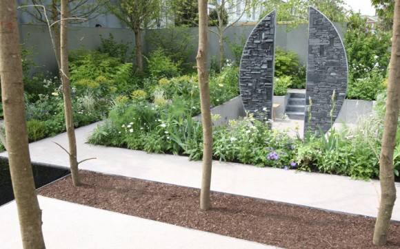
Christopher Bradley Hole also failed my high hopes. He created a garden that to my eyes looks un- finished (I can’t help but see the frame of a new house being built among a complicated garden that technically might be interesting, but is nothing that inspires me). It does make me wonder if it might be one of those gardens where you ‘had to be there’ to really get it and appreciate it…. maybe pictures just don’t do justice? But when he didn’t win best in show (an award he has deservedly won in the past) he moaned…loudly and publicly. It was in poor form to say the least…even if he might have started a conversation about judging that is worth having.

Then there was the series of metaphorical missteps. I’m putting the Seeability garden in this group. It conceptually represents four different sight conditions – cataracts, macular degeneration, diabetic retinopathy, and glaucoma – but somehow it isn’t really for blind people…what the what?
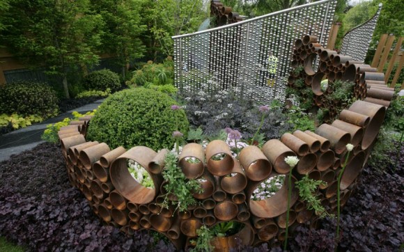
Also — there is this garden — whose description reads: “Disease and death pervade this garden, which is themed around the threat that diseases, pests and invasive species pose to British trees and plants. Features include a grove of dead trees in one corner, and a striking lonely ash sapling on its own island.” Again, I don’t see it.
Many of rest were nice but not remarkably different than gardens past. I’ll spare you my critique because I am tired of complaining. There are bright spots though. I really did love the best in show garden and am so happy for the Australian team who built it. There are some other nice ideas that I will share in time. But in the interim…I am curious if you have any opinions or feelings about this years show?
-Rochelle
Images are courtesy of Adam Woodruff. (All rights are reserved.) except where noted. Seeability garden photo and Fera Garden by martin pope from the telegraph.


What I see is a lot of geometry and from an artist’s point-of-view these designers actually entered into the contemporary fine art conversation. I think it was a good start. If you don’t get moved by contemporary art then I can see this bothering you. There’s very little sentimental, romance in modern art, but they did use romantic plants, so I totally feel it was a perfect fusion or segue from the past to the the now. In general I can’t stand sculpture in gardens AT. ALL. but if I erase the upright sculptures then, I love them! So, as far as the gardens themselves go (the plantings) they are awesome in their forms…the horizontal, aggregate materials/sculptural pathways are great and fit the plantings well also, in my opinion.
Stephanie — what a thoughtful analysis. I completely agree…the plantings are wonderful….they always are (this year included) and they are a real highlight for me. You have me thinking about the sculpture…I can’t think of many places I have really liked sculpture in a garden either (still thinking)…I maybe joining your “I can’t stand sculpture in gardens AT. ALL” opinion– or at least I am not an enthusiast….;)
you know what I want to see….and rarely do…is a few gardens that I really want to just move into…literally.
I agree, I hope the contemporary fine art esthetic doesn’t take over garden design either. I’m a romantic – natural/wild garden girl all the way. There were a few that brought the “contemporary abstract aesthetic” into the garden in a really beautiful way…back in the 50’s early 60’s, such as Roberto Burle Marx—but few have his classy taste. By classy, I mean to remember to give a nod to traditional simplicity in both Eastern and Western cultures. I think the abstract contemporary aesthetic of today is waaay too cluttered. A real indicator of the information overload we experience in todays culture. 🙁
I went and agree that the gardens were underwhelming. With a few exceptions they didn’t seem concerned with beauty, just with trying to be edgy. I really hope this isn’t a value from the art world that is now going to infect gardening and garden design. The Great Pavillion made up for it, though: it was a horticultural wonderland with everything well labelled. I learned so much. For instance, there was a Cornwall-based specialist in South African plants who had the most interesting restios…
I just looked up restios…..so cool.
That wall in the Seeability garden is rather nice.
As is the sculpture in the dead tree garden.
Items to takeaway.
Looking forward to your further commentaries.
Totally agree with your observation on the Christopher Bradley garden – it looks like footings for a building. I guess however, in the quest for something different, designers will always risk polarising opinion.
Thanks for covering the event. I didn’t go but I think too many gardeners are looking for “progress” when they should be looking at what moves people’s emotions.
For a simple nature lover, the most evident thing missing is the riot of colors that one generally expects from a flower show.
Plant House
Hi Rochelle
I felt really flat this year walking around Chelsea and felt that the normal, excited atmosphere was missing….maybe it was just the weather.
It almost feels that we’ve reached the end of a period where the designs have become quite formulaic and the designers have done all they can with this style of garden using soft, mixed plantings with a formal layout.
I agree with you regarding the awards and think that the sponsor pressure on acheiving a Gold leads the designers to creating safe designs. The high number of Golds this year may well reflect the number of designs that adhered exactly to the design brief, but unfortunatly they medals do not reflect the standard of the garden in some cases.
Loving some of the fresh gardens though and I enjoyed the concept behind Kate Goulds reclaimed garden.
I agree alastair….and I really liked Kate’s Garden as well — hope to make a post about that soon. It was def. one of the few that caught my eye.