It is not often that a perfect picture crosses my desk. A picture that so precisely shows how, by playing with one the basic principles of design (in this case, scale and proportion), you can create something extraordinary. Playing with scale and proportion are one of the easiest and most fun ways you – as a garden designer – can change how a landscape feels or is perceived.
Take a look:
Mastering the Principles of Scale and Proportion in Landscape Design
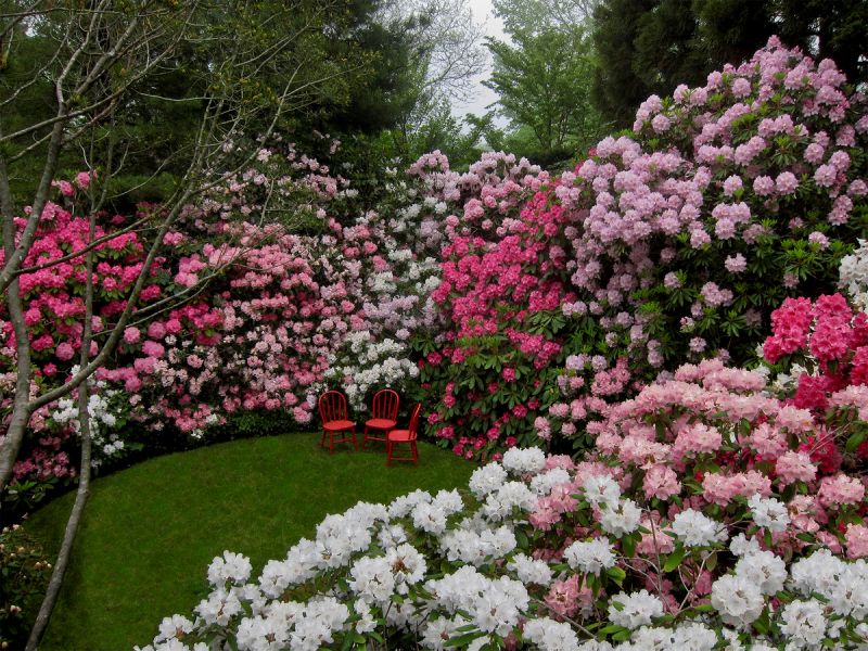
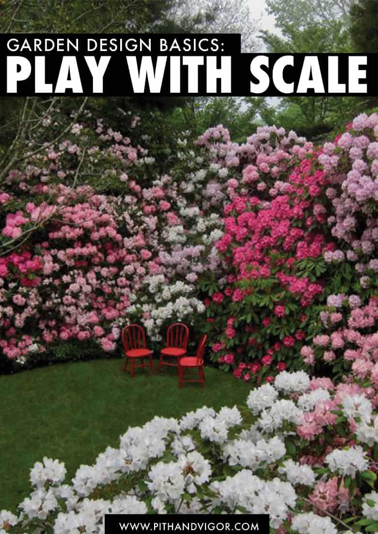
Those rhododendrons look huge and I want nothing more than to sit amongst them in one of those tiny chairs. The invitation to feel diminutive amongst such wondrously large blooming shrubs is almost too much. If I were five years old, I would run there, spin around and flop down on the ground while completely ignoring my mother’s cries to stay in sight.
But here is the funny thing about this picture. I’m not sure if those chairs are full sized adult chairs, rather, are they smaller kid sized chairs? If so, the change in scale makes the shrubs look even larger. Or perhaps the plants are so large the chairs seem really small, even though they are normal sized. Either option is fun to imagine.
And this is the point of illustration.
Scale in landscape design is one of many things that can be tweaked to create something a little more surprising and interesting. And unlike other design practices – where there are natural limits to how much you can play with scale (like the font still needs to fit on the page or you have to be able to walk around the sofa) – when we play with the principles of scale in garden design, the sky is (literally) the limit.
I suspect those chairs are kid sized. The Rhododendrons look pretty great no matter what the chair size – but by playing with the scale of the small pink chairs, suddenly makes the design comes alive in a whole new way.

What is scale in landscape design? Understanding Scale vs. Proportion
Scale and proportion are key considerations in landscape design but they are slightly different. Scale refers to how elements relate in size to a fixed reference point, while proportion is about the balance between different elements’ sizes within a composition.
For instance, in a garden, having a large tree near a delicate groundcover showcases a contrast in scale. On the other hand, ensuring that a grand fountain is surrounded by appropriately sized planters demonstrates a sense of proportion. These principles guide the harmonious arrangement of elements in a landscape, ensuring a visually balanced and aesthetically pleasing outcome.
Human-Centric Design and the Principles of Scale
Landscape designers have to think about Human-Centric Design because it can be tricky to create outdoor spaces that align seamlessly with human perception and comfort. The outdoors is vast and roofless, and it feels like we can just take it all up – but when we do that, we usually end up with something that doesn’t feel great.
Landscapes aren’t just pretty pictures but spaces that need to vibe with human vibes.
Human centric design acknowledges that the ultimate users of our manmade outdoor spaces and gardens are people, and our needs and experiences should be at the forefront of our design decisions.
Consider a sprawling park with a vast open field – while the expanse might offer a sense of freedom, it can also lead to a feeling of isolation and exposure due to the lack of defined human-scale spaces. Conversely, a small courtyard with cozy seating areas and lush greenery will have a sense of intimacy and warmth.
Adjusting to make sure that your landscape’s design is at human scale is the secret sauce to make spaces cozy or expansive, intimate or grand. By tweaking things like walkways, seating areas, and plants, designers can practically flip the emotion switch.
Picture this: wide paths and spaced-out benches for that “Wow, nature’s huge” vibe, or snug paths and comfy seating for the “Ahh, this is my happy place” feels. Neither. is wrong, but each has its appropriate place.

Using Scale Design Principles to Establish Landscape Focal Points
Focal points are those eye-catching spots that don’t just make your landscape pop, but also have a sneaky way of taking your attention off things you’d rather not see. It’s like the art of misdirection, but in a way that’s all about visual delight.
So, how do we pull it off? With scale.
Outsized scale is often what makes a focal point a focal point. Imagine you’ve got a massive, majestic sculpture right at the center of your garden – it’s like the rockstar of the show. But don’t forget the supporting acts – smaller elements like cool water features or unique plants. These design sidekicks play their part by adding depth, contrast and proportion, making that focal point shine even brighter.
And here’s the fun part – if there’s something you’d rather not have as the star of the scene (like that not-so-pretty shed or the building beyond the fence), a well-placed focal point can do a bit of “Hey, look at me!” magic. (and suddenly you just don’t notice those not so nice things… but you didn’t have to plant a giant hedge or build a wall to do it)
It’s not just about making things look cool, it’s about orchestrating the visual symphony in your landscape.
Proportion and Scale with Plant Selection
The plants you choose aren’t just there for looks; they can also be the architects of scale and proportion in garden design. A single towering tree can turn a tiny backyard into an enchanted forest, while low ground-huggers can make a vast garden feel cozier than your favorite sweater.
Plants hold the power to change the whole vibe. Plants can compliment and expand your space’s personality.
Consider a formal garden with neat rows of colorful flowers. Or maybe those rows are of shoulder height shrubs. Then think of how different it would feel if you couldn’t see over the shrubs. Or a wild, open naturalistic landscape with native grasses. Each plant choice shapes the story your landscape tells.
Grouping together plants of similar sizes creates balance in the plant painting. Building layers in your planting is like adding brushstrokes – taller plants in the back, shorter ones up front. Use them to create depth and intrigue.
When you’re shopping for plants, remember, it’s not just about colors and shapes – it’s about creating a living, breathing masterpiece where the plants can come together to create scale and proportion that augments your garden’s style.
Scaling Hardscape Elements
Paths, patios, and structures lay the foundation for your landscape. These aren’t just bricks and stones; they’re the backbone of visual harmony.
Imagine you have a petite path that’s barely there next to a massive, grandiose patio – it’s like having a whisper next to a shout. Does that work? (A: probably not)
To keep things groovy, you need to adjust their proportions like a DJ. If you’ve got a modest garden, a narrow, winding path can lend a touch of whimsy while keeping things cozy. For a larger space, a spacious patio with a grand pergola can make you feel like you’re in a luxurious retreat while also responding to the size and scale of the landscape.
Playing with Perspective and Scale in the Garden
Visual perspective is like a hidden ace up your sleeve in landscape design – a way to make your outdoor space feel bigger or deeper than it really is. It’s the art of playing with dimensions, and guess what? Scale and proportion are your tools here too.
By tweaking scale and proportion in your design, you can work visual magic that adds an illusion of depth or size to your landscape. Imagine a path that winds into the distance or planting beds that gradually narrow – it’s like casting a spell that makes your garden seem full of secrets. The path that you can’t see the end of creates mysterious depth. The beds or paths that narrow in the distance can play tricks on the eye and mind (just like a perspective drawing does) to make distances seem closer or farther. These subtle tweaks to scale and proportion can literally make the whole space feel more expansive and like an unfolding story. So, when you’re sketching out pathways or arranging your plants, remember, you’re not just creating a collection of garden spots – you’re crafting an experience through the magic of visual perspective.
Miniaturization and Maximization
You can take scale and proportion and perspective in garden design to their extremes and we end up in the world of Miniaturization and Maximization – where your landscape becomes a canvas for creativity on steroids. It’s like having a remote control for reality, allowing you to shrink elements for a dash of charm or amplify them for a dramatic spectacle.
It can be a petite fountain tucked in a corner, whispering elegance or that massive sculptural centerpiece demanding attention like a rockstar on stage. The extremes aren’t just about size; they’re emotions in 3D. And you can use them to communicate and encourage how you want to feel in that place.
It’s also about throwing curveballs into the mix, creating excitement through the unexpected. Things that are outside of our natural expectations for size and scale catch our eye. It is why we are drawn to fairly gardens and bonsai (we expect trees to be enormous by comparison to ourselves… but when miniaturized they instantly capture our attention because of their unexpected scale). Undersized and outsized things capture our attention and sense of romance (at both ends of the scale spectrum). Whether you’re dialing things way down or turning up the volume, the art of extremes turns your landscape into a more thrilling adventure.
Using Proportion and scale in Landscape design to Harmonize with Architecture
Harmonizing your garden with the architecture of your home is like finding the perfect duet partner. Make sure your outdoor design vibes with the style of your home or building.
Think of it as a dance – the architectural style leads, and your landscape tends to follow its rhythm. When your home flaunts sleek lines and modern vibes and your landscape echoes that with clean, minimalist design things feel great (Good design can make 1+1 equal 3).
But if your house has a more rustic charm that same modern garden is likely to feel more like 1+1 equals zero. You would be better off aiming for cozy vibes with natural textures and organic shapes. Scale and proportion are at work here too – your built structures should be in sync (in scale and proportion) with your garden creations. I use a grid system (that I teach in my garden design courses) to ensure that my landscape plans are not just in sync with the architecture in scale but also that my designs place prominent features (like trees, patios, paths and focal points) in a way that they are best enjoyed by the people that live in the house – but also that they make the house even better than it is on its own.
When you’re crafting your landscape, let the architecture lead the dance.
Addressing Large Spaces and Small Spaces
Whether you’re working with a vast canvas or a snug corner, mastering the balance between Large Spaces and Small Spaces is like tailoring a suit – it’s all about the perfect fit.
In roomy landscapes, the challenge is to fill the space without drowning it. Here, scale and proportion come into play with grand gestures, like a commanding tree as a focal point or expanses of vibrant plantings that embrace the openness.
On the flip side, when space is at a premium, it’s about making every square inch count. Petite seating nooks and vertical gardens become the stars.
The trick? Adapting your design choices to the space available. So, whether you’re crafting a cozy haven within limited dimensions or crafting an immersive experience across a sprawling terrain, nailing scale and proportion ensures your landscape is finely tuned to its unique dimensions.
Navigating Slopes and Gradients
Navigating the twists and turns of slopes and gradients in landscape design is like solving a puzzle with an unpredictable shape. The challenges are real, but so are the opportunities. Designing on uneven terrain demands a bit of extra finesse – it’s about making sure your landscape doesn’t feel like it’s on a roller coaster.
Use scale and proportion are design principles that can minimize the discomfort that a slope can cause. For instance, terraced garden beds that mimic the slope’s contour can lend a harmonious flow, preventing a disjointed vibe. Likewise, strategically placed steps with proportional risers create a sense of rhythm, taming the slope’s unpredictability. It’s all about striking that balance – not letting the terrain overwhelm the design, but rather integrating it into a cohesive and visually pleasing masterpiece.

By thinking strategically about size, you can transform a cozy nook into a grand retreat just by using larger elements, or likewise, turn a vast garden into a series of intimate escapes by embracing snug proportions and scale in the landscape design. Size is more than just measurements; it’s emotions translated into space.
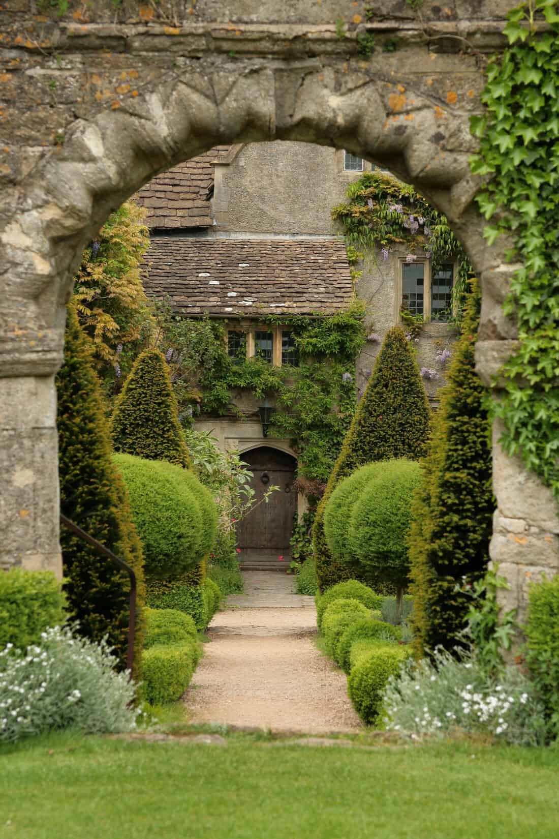
A towering entrance gate sets a particular stage – its scale can instantly craft emotions and tales. Think of Alice stumbling into Wonderland (which is kind of how those giant rhododendrons and tiny chairs make me feel) – the change in scale altered her perception and emotions entirely. Scale is a storyteller. As you bring your design vision to life, remember that scale isn’t just about numbers – it’s about sculpting emotions and narratives that resonate through your landscape.
Can you think of other ways that you can play with the principles of scale in design to make some thing more interesting?
Image by sakonnetgarden. Sakonnet Garden in Little Compton, Rhode Island is occasionally open to visitors.
I can think of paving stones. The majority of the big box ones are small, and when pieced together they kinda run into each other and the shape of each stone gets lost. Larger paving stones make for a more dramatic effect, the design is more apparent, and the individual shape of each stone is more noticeable.
Totally agree Matt!
Wow, Floriferous! What about a garden of giant herbaceous perennials like Cephalaria gigantea and Cardiocrinum giganteum? Like Alice in wonderland.
Jessica – I love that idea…someone once told me about a garden designed with that very idea (in the south of England somewhere) — but I can’t remember who or where it was…on a forever search for that. Giant plants everywhere to make you feel small…totally fun.