When I saw this before and after, I immediately recognized the inspiration source – even before I read about it. The Hempel Hotel is one of those hidden London places that all the neighbors know. It is perfectly placed in an area with lots of tourists on foot. It’s little breaks in the walls give glimpses that get enough street traffic to peak everyone’s curiosity. Honestly, I don’t know anyone who lived in that neighborhood who didn’t take some stolen peaks at the cool garden behind the wall.
(Maybe you remember a while back, I wrote about how the Hempel was my favorite hotel garden you can click through to remind yourself of the inspiration source).
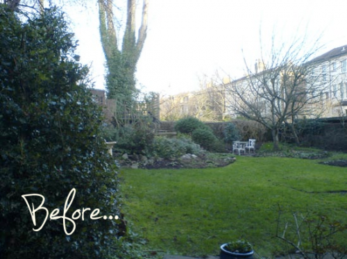
So with the Hempel as inspiration, Designer Katherine Edmonds created this strikingly stylish residential garden.
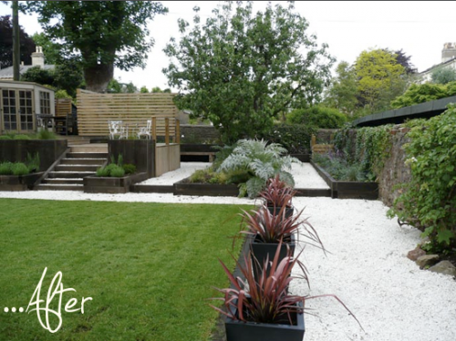
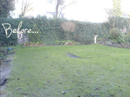
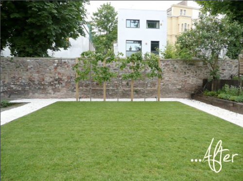
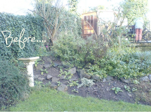
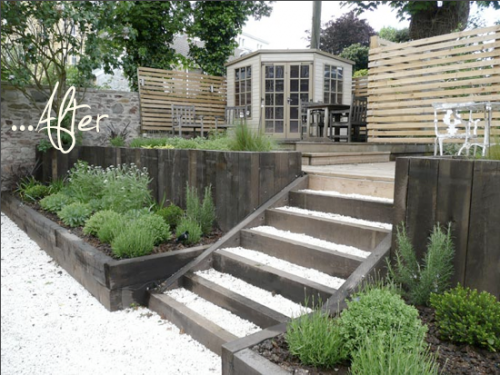
Can you see the obvious translation with the square cut lawn and the white gravel? The pleached Limes? And I am really enjoying the designers twists like the cardoon. I am a little obsessed with those and think they might have to be added to my 2011 garden. What about you, what do you like about the design interpretation?
A little note about the gallery : Please accept my apologies for the lame way that you cannot click through the gallery from image to image. It has been a thorn in my side for a while and knowing that it bugs some of you too, has moved it to the top of my ‘to fix’ list. I think I have found the solution, but trying to modify my blog template is not so simple…patience….I will let you know when it is fixed. Thanks for the feedback.
“A little note about the gallery : Please accept my apologies for the lame way that you cannot click through the gallery from image to image. It has been a thorn in my side for a while and knowing that it bugs some of you too, has moved it to the top of my ‘to fix’ list. I think I have found the solution, but trying to modify my blog template is not so simple…patience….I will let you know when it is fixed. Thanks for the feedback.”
Good to know.
And here I am again, a thorn in your side.
The work you are looking for is ‘pique’, sounds just like ‘peak’ or ‘peek’
http://dictionary.reference.com/browse/pique
With the best of intentions (hello, road to hell!)
Jenn
The current designer has much more sense about spatial clarity and scale. I think the long gravel bed adjacent to the wall could have been served by becoming a bocce court, don’t you?
And the white gravel seems out of place- better to use materials that respond to the site or region more sympathetically, but the transition is interesting.