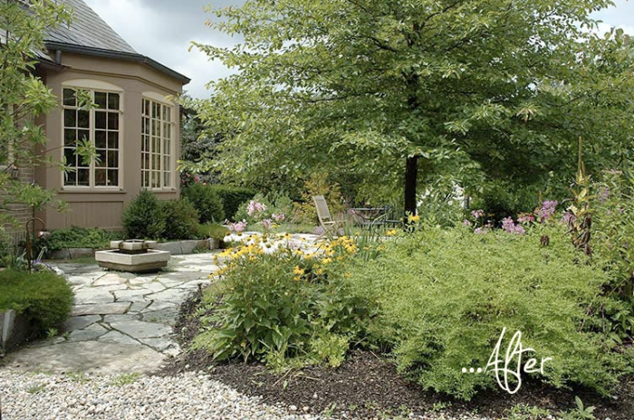
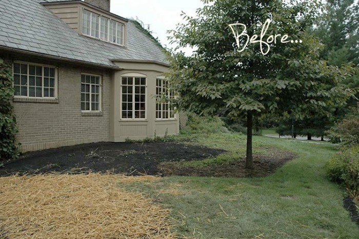
So often I see projects that are completed by designers or builders that have no soul. Sometimes it is a matter of the picture being taken too early and the garden just hasn’t grown into itself yet, but more often the edges are too straight, the plants are too quarantined from each other, and the design looks a bit too over wrought and precisely executed. Unless we are looking at a precise modern garden, I prefer the opposite. This garden looks so relaxed and nicely aged and has none of those issues. Plants are happily jumbling together, paving is natural and messily but realistically flows into a gravel area. And the water feature looks like it was a happy addition that seamlessly blends into the established garden in an eclectic, not too planned out way. Aiming for this look in a before and after is what I always strive for and enjoy, but I it find more difficult to create this than the straight and clean hyper-organized vision that is often the result of a new build.
 Design by Landscape Architects. Thanks Louise for sharing!

+comments+