Once upon a time, my shed/ chicken coop used to be cute. But then I messed with it, and then I wrote a book and I ignored it, and now I have a big fat mess.
Here is what it used to look like:
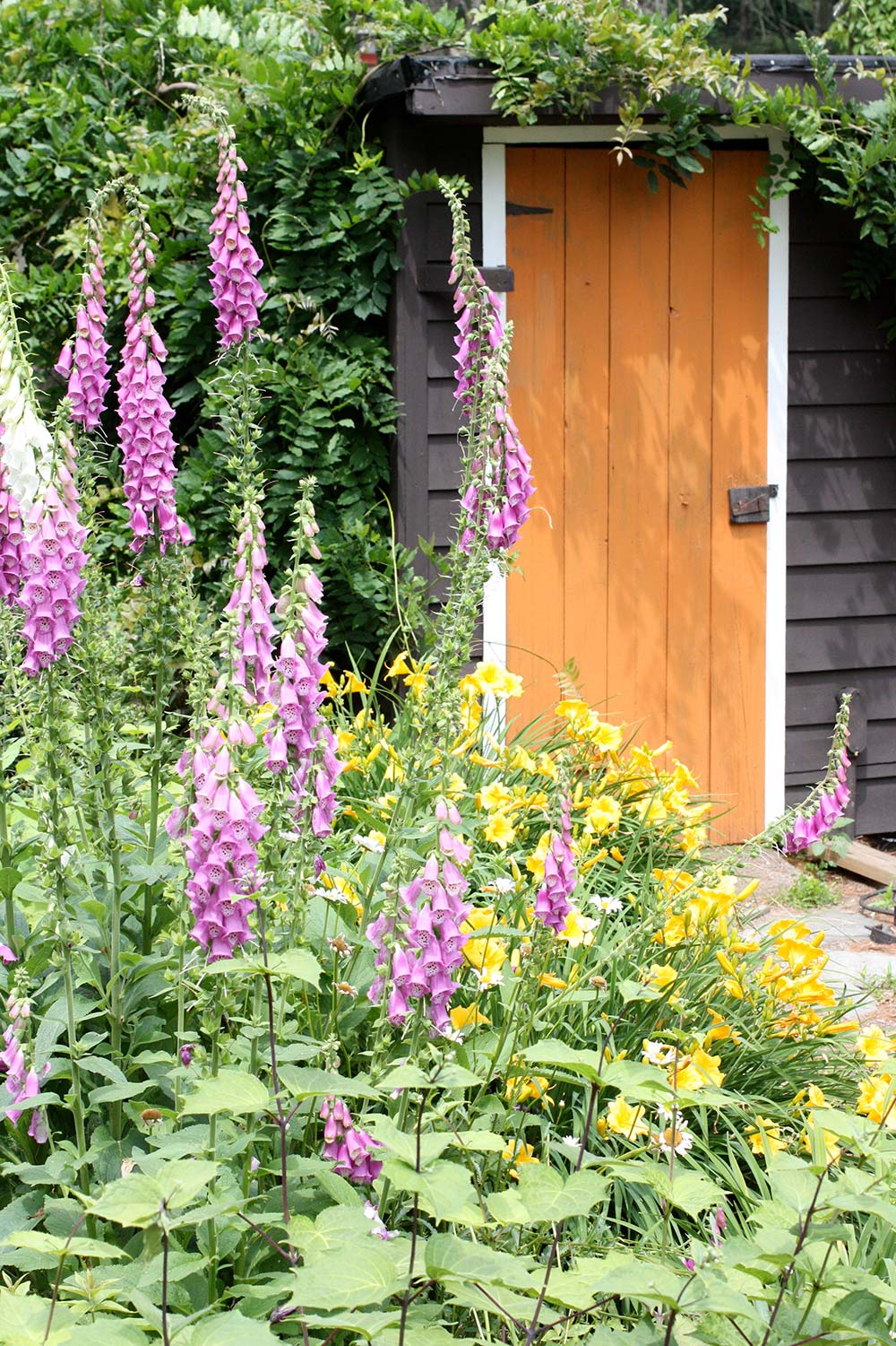
I was into orange like crazy, the foxgloves were happy, and I hadn’t yet given up on the bloom-less wisteria (it was replaced with a climbing hydrangea that hasn’t gotten tall enough yet to train over the door).
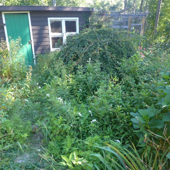
Last year I decided to paint the door to freshen things up and try something new. I opted for green and I will be the first to admit my mistake – it just didn’t have the magic I was going for. Green isn’t really the most exciting backdrop for garden plants and if you want to make a splash, you have to be a bit more brave. (shall we all agree to ignore the out of control weeds that took over and choked out my foxgloves while I sat inside writing?)
So over the weekend I thought I’d try something new. I had high hopes for this lavender raisin sort of color, but once I got it on, I was shocked to see that it had no contrast to the rest of the dark brown shed and really just looks like a washed out version of siding. Yuck!
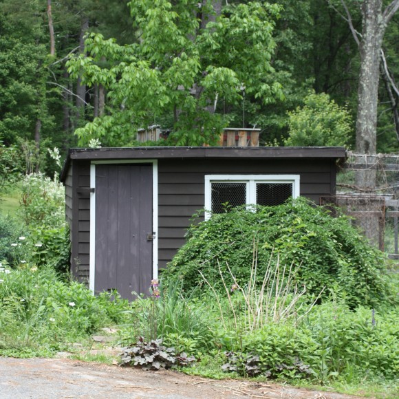
Back to the drawing board!!! I am so grateful to Sherwin Williams and their online tool to try out colors on a photo that you upload.
I plan to re-stain the shed — to make it true Black (this is happening to our whole house too) and I used the tool to darken up the dark brown to look more black so I could get a good contrast.
I also thought that maybe if I added some of the white paint that I have on hand I could save a few dollars and lighten the color I just bought to something a little more lavender/grey. I think it is better (see the left)….but still not bold enough.
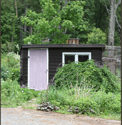
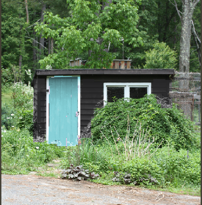
I’ve been toying with the idea of blue, so I edited out the lavender to try light blue (on the right) and I think I am finally on to something. Would you agree? Blue is better? Am I the only one who struggles with this? I am really wondering why I messed with a good thing!
Now I just need to spend a day ripping out bunch of creeping charlie and the gooseneck loosestrife that has taken over. The dwarf mounding weeper that I have hated since we moved in is going to meet an untimely death by chainsaw and I think I am going to replace it with a few more pretty blue hydrangeas (my existing one took quite a beating this last winter but survived – you can see I still need to cut down the dead canes in the foreground).
You can hardly tell, but there are a couple of baby aspen trees in there and the foxglove simply needs to be reintroduced – I love it – and I think I will try white this time. This is going to take a little effort (and time), but now that I have the backdrop sorted out I think we can start to move forward…unless you have a better idea for a door color….because I obviously haven’t tried everything….yet. 😉
Sherwin Williams paint is available at Lowes.
Images by rochelle greayer
Disclosure: This post is sponsored by Lowes. This is a series that I am doing through the end of the year. I am not an employee of Lowes and all opinions are my own. See the other posts in this series.
I like the lavender the best and I think it could set off your flowers really well. For me the white trim isn’t really working with any of the colors. Maybe a contrasting trim, or matching the siding?
I like the blue best, but I agree about the white trim. Should it match the door?
I like the blue best, but I would REALLY like citron!
I love the posts where you show your projects before and after…great ideas, really useful.
I would like a red door with the siding being so dark and sorry but I like the white trim.