I’ve got a backlog of open tabs (again) – all things I think are worth sharing with you – but that I haven’t had time to write a whole cohesive post about. My computer is getting sluggish because of it, so I need to shut those tabs down!
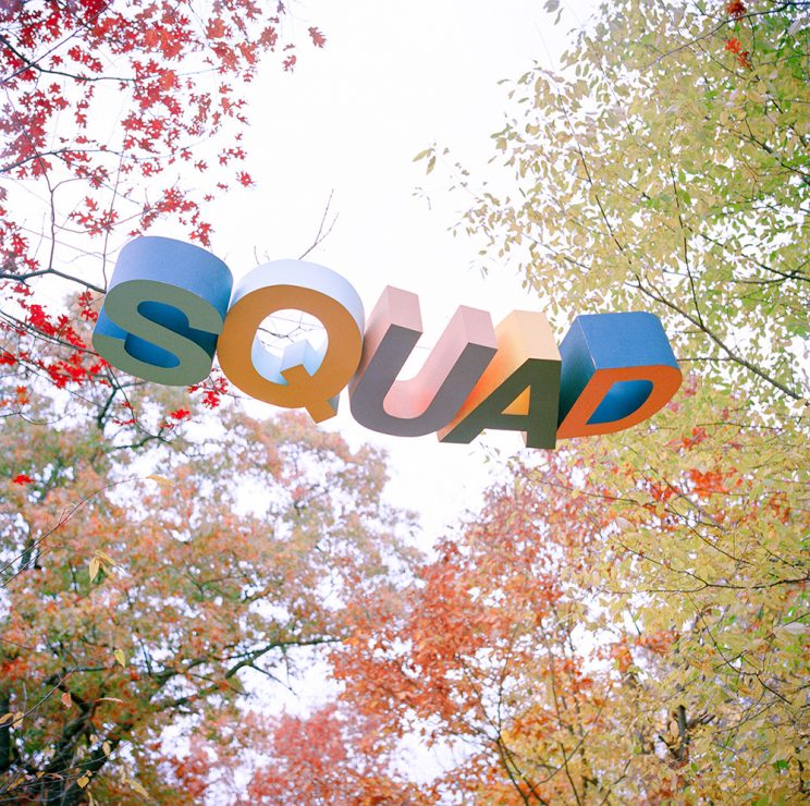
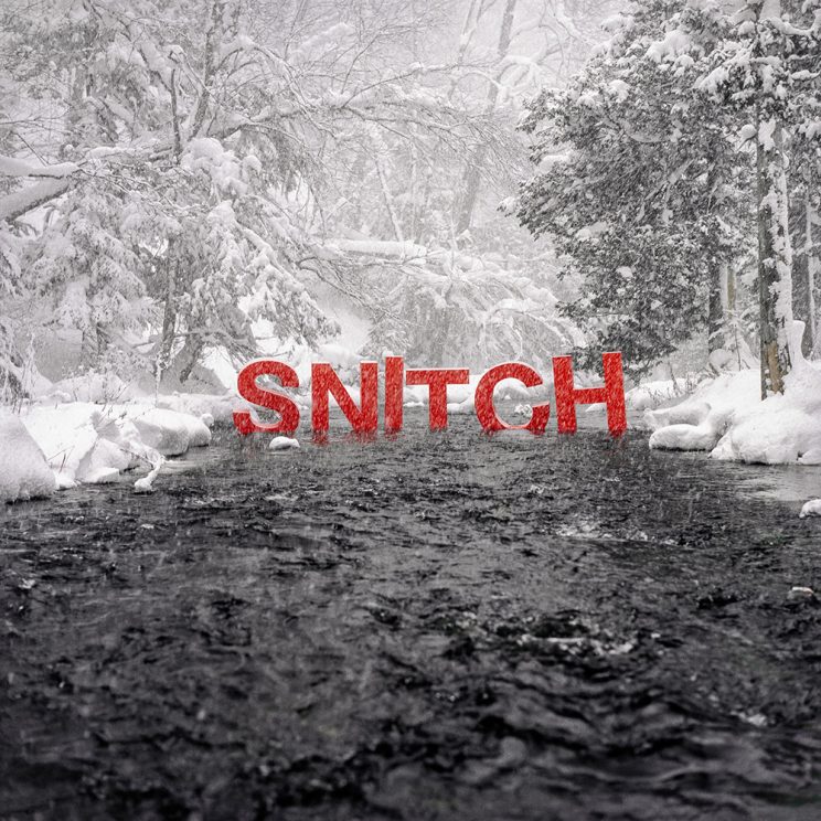
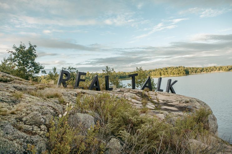
I’m going to fire off a few short posts just to clear out the backlog – starting with Trevor Dean Whatley’s cool landscape typography (which I am in love with).
Pictures of unexpected typography in landscapes makes me happy. It also reminds me of beloved artists like Any Goldsworthy. There is something about finding wildly incongruous visual statements in a natural setting that really captures my eye. Does it do the same for you?
However, it makes me wonder, if I were to happen across something like this while on a hike – would I find it so attractive? Or would it feel entirely creepy. I think creepy – like I’d stepped into an episode of Stranger Things (but with a rogue graphic design monster instead of the Demogorgon).


Pop on over to his site for a whole load of other installations.
I’m not taken with typography in the wilderness. Its too much like the stones you can throw in the garden – or anywhere – saying Peace or Create or some such positive thing. That is not why I walk in fields or woods.
I agree, I don’t care for those either – but I do like this as installation art…
Whatley’s Cool Landscapes leave me cold. His typography in the wilderness is a little too like the stones you can buy to scatter in the garden Peace Create, etc. etc. I don’t want to be told what to think or be feeling.
Certainly a very interesting and unique way of expression. Not sure it is my style though! I love my typography and use it in my own vinyl art expressions, but somehow the mix of nature and bold letters take away from the feeling of peace for me.