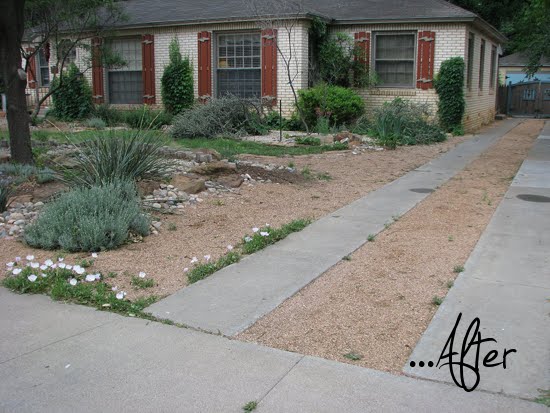
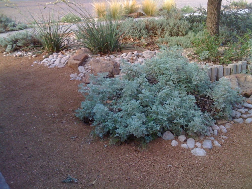
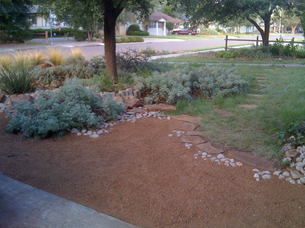
Susan’s own description of the look she is trying to create in her garden puts a smile on my face.
She calls it:
“hardscrabble prairie/desert oasis/Texas cottage/woman homesteader/grubby child wandering through an arroyo on a Saturday morning”
It makes me think that there is nothing to be lost in trying to be more wordy with my design vision descriptions….


Through a series of front garden makeovers, I think she achieved what she was going for ….don’t you? I really like it and love seeing a garden that by nature of its location is so completely different than my own. You can see more about Susan’s garden at her interesting blog called the bike garden.
ok I’m confused. You have 2 afters, one with the house windows painted in red and one that realy look very much like the before image. In one image thare is a tree brach missing and in the last image the tree brach reapears, so what’s de deal?
And aestheticaly speaking I realy thing before was better , just needed some cleaning and some colors there, problem not realy solved in the new graden design.
Realy nice blog… cheers from ROmania!
there are a couple afters as there was a general makeover and then some upgrades made later….I included all the images I found…you notice details!! Personally, I love the makeover, I think it is probably more in keeping with the neighborhood, the climate and is a more responsible type of garden in this part of the country
Great color examples there! Looking forward to reading your next installation.
I met Susan at Buffa10 — she’s great and one really smart cookie. I’ve been reading her blog for a long time…