Stacy Bass is back with us again with another enlightening session to help us all take better garden photographs. Stacy:
I’ve been thinking a bit about composition of late. Rochelle expressed some interest in hearing more on this topic and just recently, a friend asked, “how do you decide what to include in the picture? Are there any rules about how to do this “properly?”
I admit I was tempted to google “rules of composition” as a starting point but thought better of it. How much more interesting, I thought, to just try to examine and explore my thought and decision process in making an image.
As I talked about in an earlier post, I am very conscious and careful about really choosing the frame-what stays in and what stays out. The question of composition, though, is a bit different. Once you decide what you want to
include, how do you organize it within the frame for the most effective or impactful result?
Some truths started to emerge as I looked at a series of my images so I will do my best to convey them here.
First, balance. Interestingly, I find my images are more balanced, on whole, when they are off center. This is especially true for me when shooting wider landscapes or gardenscapes when the frame is horizontal.
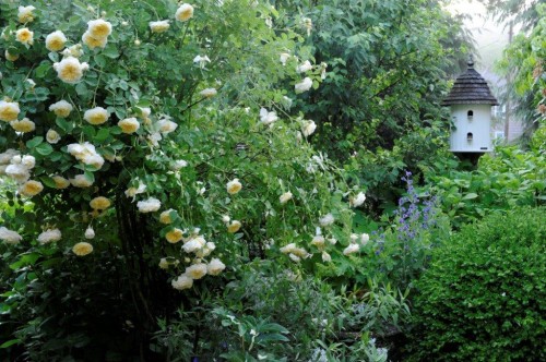
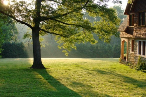
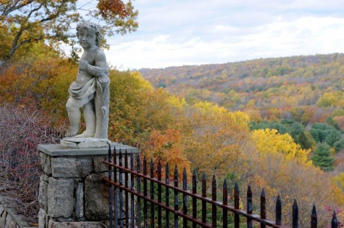
The shots that I turn to, time and again, as favorites, tend to have something on one side of the frame that provides the most interest, is the “subject” of the image and in effect anchors the remaining elements. Remember to keep in mind the power of negative space as a visual element. I find this off-center subject visually more engaging and closer to the way you would regard the scene if you came upon it. This mirrors my philosophy on tighter botanical shots where, as I’ve indicated, I strive to have my images look less like “portraits” of the flower (e.g. front and center) instead try to place the flower in the frame in a very deliberate relationship to the background, color, tone or mood that surrounds.
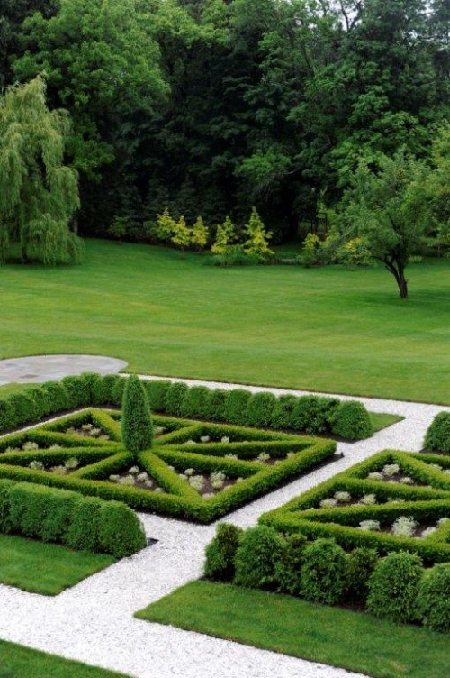
A second theme or truth is symmetry. While symmetry is something that I actively pursue when shooting interiors, with gardens, I notice that I try to frame my shots to echo the feeling/tone/direction of the garden instead of forcing a “set” approach on it. With very formal gardens or even informal ones that are defined by their structure, symmetry works. It allows the structure and pattern of that garden to shine through. In fact, ignoring that symmetry can result in not only a failure to convey the reality of the space but also an image that looks uncomfortable and off kilter. With more rambling and free form spaces, two things can work. Symmetry, if you can find it, can help bring a visual order to the scene that makes it easier to understand, or a deliberate lack of symmetry can heighten the more natural flow of the space and better convey its tone.
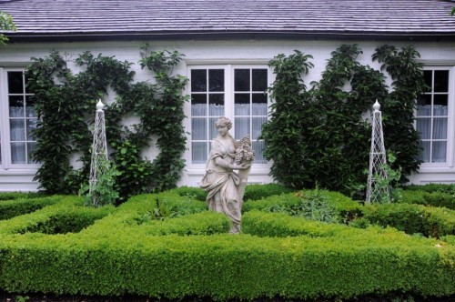
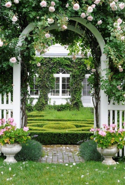
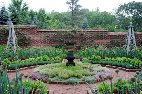
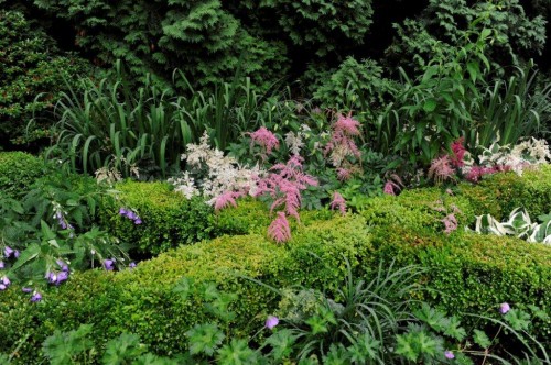
In the end, the more effective images are ones that are able to transport your viewer to the place you’ve “captured” for them. And that skill, or gift. . .isn’t so formulaic. But when all of the elements really come together-light, focus, framing, composition. . .it sure is beautiful.
Excellent article Stacy , but if your article is directed to landscape designers you are giving many of them too much credit to begin with.
Have you ever looked at the portfolio photos of landscape designers ?
Most of them don’t even know when to shot a photograph or how to basically clean up the site before taking the photograph.
So composition is way beyond many.
Start with informing them about the rock bottom basics of quality of light and when to photograph to get the best sense of light.
Great info though.
Thanks
oh – good idea Michelle — maybe a post about staging up/ prepping a garden for a photo shoot — might be stating what seems obvious, but maybe we can all learn something…..Stacy did already do a post about light though…(I think her first) — check it out.
thank for the tip Rochelle, I’ll check out Stacy’s first posting.
Michelle