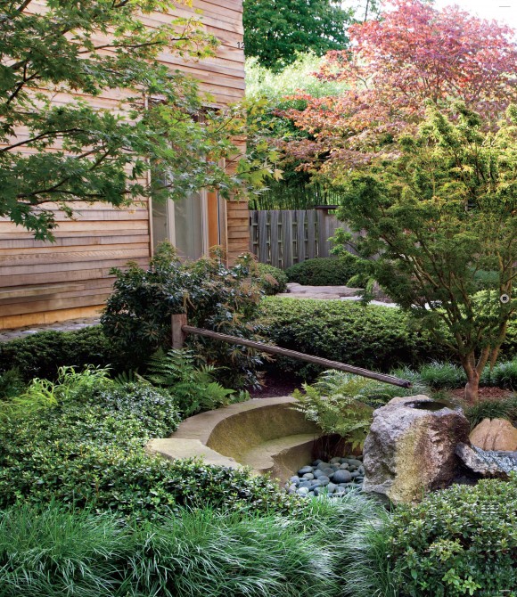
Have you noticed the graphic design makeover of Martha Stewart? I really like the new modern fonts and clean styling. I’m also kind of liking the series of stories that share some great practical styling tips for gardens. This month (the issue is on stands today) we learn about capturing the essence of Japanese style gardens.
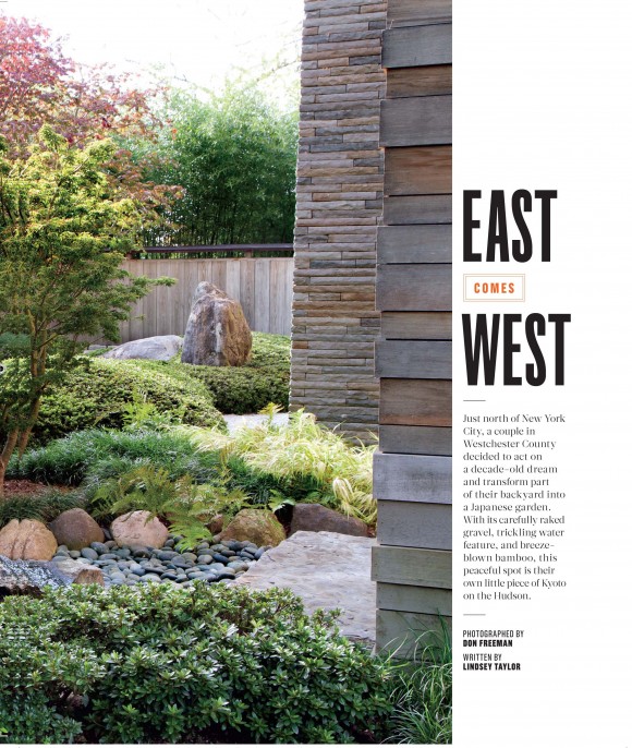
The story is nicely organized and shares the basics of getting the look. If you want to know what tips 1, 4, and 5 are, you are going to have to buy the magazine.
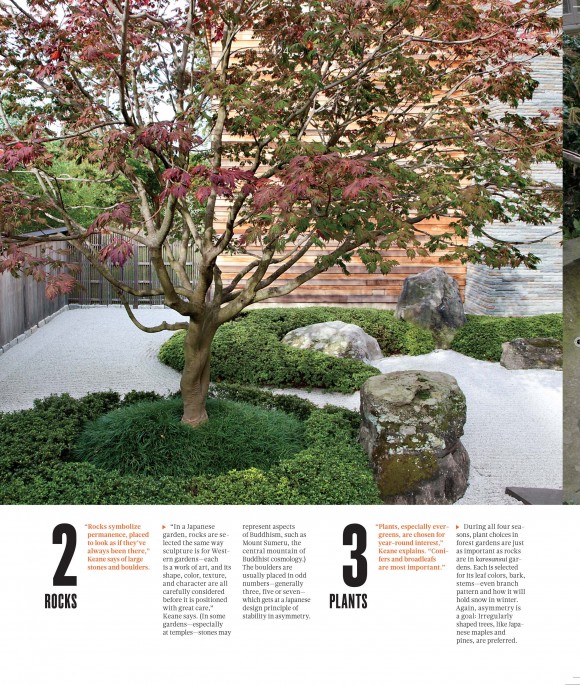
I have to admit though that I find it almost unnerving that there is a lot of similarity to the content of my book project (my manuscript is due in only 6 short weeks!). That is probably why I find this so lovely and intersting…but I also am intrigued by what wider inspirations have lead to similar approaches. Have you ever had that happen where you design something and some else does something super similar….but there is no way that you could have copied or been directly influenced by each other? Fascinating.
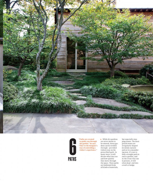 I’m looking forward to my copy coming in the mail and seeing the rest of the story….and also (hopefully) finding some new organizing tips. As I wrap up this project…I am all about simplifying and making things a little easier and less stressful for a while. – Rochelle

Images courtesy of Martha Stewart Living.
I am looking forward to the release of the complete set of tips; the pictures are wonderful.
These garden designs are exceptional. Thought you might be interested to discover MyGarden 3D. It’s a cool application for consumers to (re)design virtually gardens adding virtual plants and outdoor equipment a photo a real environment. More info at http://mygarden3D.com.
Alain – MyGarden 3D marketing