There were quite a few events over the 2 days that I attended. These are my thoughts about each.
Town Hall Meeting
Looking back (and writing this after the fact) – this was easily one the best events for my purposes to attend and the best part is that it was free! If you are attending HD Expo and they continue to do this event (organizers please take note— you should continue to do this event), do not miss this event. The list of people in key positions who attended this one meeting was astounding and you get the opportunity to ask them whatever you want in an intimate setting. Our table only had 5 people, so as the VIP’s rotated through the tables, the conversation was easily manageable and everyone got to speak and ask what was pressing. John Leary (SVP of Marriott’s Domestic Design and Project Management Program) talked about the day to day adventures of a company like Marriott working with a designer like Ian Schrager. Karen Rubin (SVP Development, Investment and Feasibility Analysis) of Starwood Hotels & Resorts discussed frankly the relative youth of the brand and all that comes along with a young company. J. Raul Leal (President, Techton Hospitality/ Desires Hotels) shared insights about development strategy of the Desires Hotel Brand. The list goes on, the access was phenomenal and the candidness of the executives made me realize that there are real opportunities for design firms that are new on the scene.
Seminars
I attended a couple of the seminars. Design as Brand: Kor Hotel Group Case Studies and Canadian Hospitality Fosters Creative Boom, and then in the evening went to the Gala Awards. Here is what I thought (in respective order): Interesting exposure to a brand, interesting exposure to Canadian Designers (I think I was the only non-Canadian in the room) and probably not something I would attend again.
The Floor
Design Wise I found the floor to be interesting and inspiring but not too many things for exteriors….mostly interiors…as should be expected. A few things were interesting though, so I put together my Top Five Takeaways for Garden Designers and Landscape Architects from HD 2008.
# 5 Garapa Gold
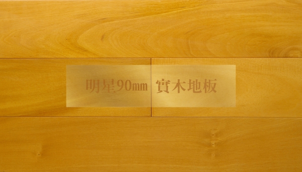
I know this isn’t a new product, but I haven’t seen it and we haven’t used it before. We specify Ipe regularly not only because of its natural ability to be long lasting and durable, its enduring beauty puts any composite to shame (and I really don’t like composites). But not every site or design is best served with the deep reddish brown color and staining it isn’t really feasible, so I am so excited to learn about Garapa Gold. It’s is 100% sustainably harvested and stands up to Ipe for its strength, span ability, hardness and scratch resistance. Work-ability is actually easier, you name it, and it is as good or better than Ipe and it is generally cheaper.
Check out the color.

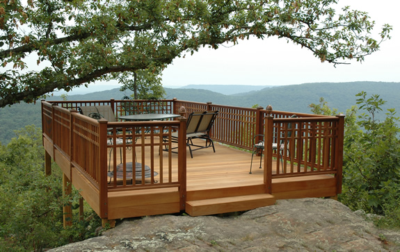
East Teak was representing the product at the show. This beautiful treetop deck from their portfolio combines Ipe and Garapa.

#4 David Rau’s Design IQ Seminar
David Rau of 3 North made one of the most interesting presentations I have seen in a long time. He is reportedly doing it again at HD Boutique (Titled: Defining the Intangible: The 2008 IQ Report on Authenticity and Value in Hospitality Design) and if you are going to Miami, you really ought to try and attend. He has devised an interesting strategy for hospitality designers based on IQ (Intangible Qualities). He talks about how he has used it on a number of his projects and how other designers might also adopt the process to engage clients, community members and other important stakeholders in deriving a design vision for a property. I absolutely loved the handouts for this seminar….the idea being that you use pictures and graphics to democratically gather opinion. In our demonstration we were charged with picking colors, fonts, chairs, and towers that we felt captured the Las Vegas vibe. What would you pick for your hometown?


#3 Suite Simplicity
I mention Suite Simplicity for one reason, as a small business owner myself, I am forever watching what other people are doing, in the industry or outside, to see what works and what is worth molding for my own uses. Currently I am obsessed with marketing. What works, what doesn’t, ROI, how to stand out and ultimately be remembered and called upon for the right things. All the same things that many of our clients are interested in as well. Suite Simplicity launched one of the most impressive Marketing and PR Campaigns I have ever been a target of. As purveyors and manufacturers of custom built hospitality furniture I am not sure our paths will ever truly cross, but I assure you that their Pre-show mail out campaign, party at the Tao nightclub, and post-show follow-up have forever instilled their name in my brain. As I go forth, I will think of them and speak well of them even though I haven’t worked with them. Proving to me, once and for all, that repetition and consistency matter in marketing, and if you can add as much creativity as you can muster, you will drive your point home. No matter what your business.
#2 Color Lady
Designers are highly aware of color, but I still found the presentation by Zara Stender interesting. Did you know…..
Red actually increases body temperature.
Pink short-circuits violence — and for this reason it is used in Drunk Tanks.
As eyes age, they have trouble processing yellow.
Blue is American’s favorite color, but too much blue makes a property harder to sell.
Deep Hunter Green is the favorite color of the top 3% socioeconomically.
Orange says friendly and affordable
Zara’s Color trend predictions for 2008:
Trend # 1 –Pinks—especially yellow pinks and raspberry pinks are hot colors.
Trend # 2 –There is a resurgence of whites with a luminescence or shimmer.
Trend # 3 –Colors that morph as the light changes
Trend # 4 –Cool grays and lots of shine
Trend # 5 –Green in all variations
Trend # 6 –Brown continues to exude luxury
And the #1 takeaway from HD 2008……
Everything is going green.
Everywhere I turned the notion of sustainability and ‘going green’ was pervasive. It is exciting to know that manufactures are prepared for the questions that designers should be asking when they specify products. While I know that Landscape Architects and Garden Designers have always, and by nature, been fairly ‘green’ we can do better to. Just a few things to think about that will help you evaluate whether a product is really as ‘green’ as it claims….Common sense is green….if it doesn’t make sense and isn’t as simple as possible, then it probably isn’t that green. Green should fit in to the local landscape – logically and in reasonable proportion. Green should work with nature and enhance the future of the Earth.
Wow! In my work, I’ve defaulted to using a lot of deep grey greens, a bit less yellow than in “Hunter,” but it has always been a color which appeals across the board. Also, it works with both warm and cool palettes. I’ve also been using a lot of orange this year, I’ve been told that it is a happy color. Thanks for the great blog post.