So jet lag is getting the best of me (and the rest of my family) — but I am getting back to normal and will soon have some fun stuff to share from my trip — but in the mean time, Stacy Bass is back with us again and is sharing with us some really interesting tips about creating photo books and her latest project, Grow, to support the Westport Green Village Initiative.
-R
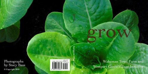
Hi again. I hope you have all been well since my last post. I’ve been busy shooting but also wanted to share with you GROW, my new book, which was recently completed.

This past spring, I was commissioned by Westport Green Village Initiative to create a book that celebrated the people and “product” of the local food and sustainability movement in Westport, CT. They hoped to distribute it to their donors and patrons at a harvest festival fundraiser in early October. It was an interesting project for many reasons. First, I felt the mission of GVI is an important one and I felt that I could use my photography to help deliver and make more compelling the message of the organization. Second, I was given an unusual amount of creative freedom to execute the project and third, I believed that the subject matter of the images (other than the portraits) would be gorgeous, graphic and rich in color and texture-perfect subjects, indeed. And as it turned out, the portraits (and the people depicted in them) were really interesting.
I will share with you some of the pages from the completed book, below, but wanted to talk a bit about making books, about almost any subject but with garden themes in particular. Though in this case, I made this book entirely using Adobe Photoshop to lay out the pages, the graphics and the text and then delivered each page as a separate file to the printer-Disc Graphics-in Hauppauge, NY for printing on their digital press. More frequently, I make use of online- accessible book publishing sites and of course, you can too. While there are MANY companies that offer this service, the two I can most highly recommend are MyPublisher and Blurb. Though Blurb is more popular in professional photography circles among those that want to self publish or perhaps intend to use the book as a marketing piece or portfolio piece, My Publisher is very consumer friendly, has excellent options from which to select and has VERY easy to operate drag and drop software. These are all available as downloads and are free so .. ..take them for a test drive and see which one works best for you.

In terms of layout, I will try to convey some of the lessons I learned from this book project-as well as the over 100 books (yes, obsessive in this regard) I have made with My Publisher and the like, over the years. For Grow, I was looking for a simple and clean graphic message. The final trim size of the book was to be 8 inches square and I wanted each page and each spread to stand on its own visually. Thinking about which images to place on
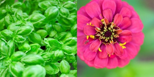
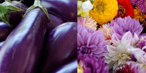
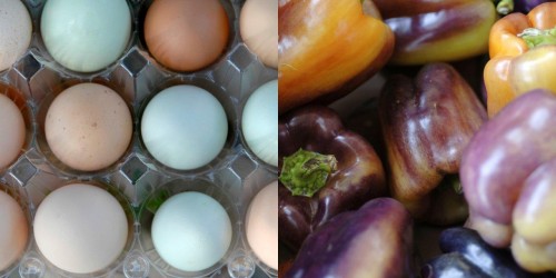
opposing pages is perhaps the most fun as well as the most challenging aspect of layout. I wanted the spreads to work in terms of shape, structure and color.

I wanted the images to both complement and compliment one another-either because of a clear contrast or a beautiful echo or symmetry in the images. I was very focused on the interplay between the color in each of the images and wanted to be sure that the pages worked together and didn’t draw attention away from one page in favor of the other. I can’t say for sure if I was successful in every case but I will say that as the pages and the layout fell into place, the pairings mostly seemed effortless and natural and I feel confident that the final photographs are strong.

In other book projects, I try to create patterns and relationships among the images. For example, alternate a wider view of the garden with some tighter botanical shots. This will convey the impression that the botanical shots are elements from the larger scene that you have selected to highlight.

Other things to keep in mind.. . While it feels good and natural to have a pattern in the layout (e.g a large horizontal shot on left page, two smaller verticals on the opposing), allow yourself to consider varying the layout so that the reader’s eye and interest is kept active and engaged. Sometimes there is a strong editorial reason to be consistent and sometimes, as long as the images are paired in a visually interesting way, it’s fine to let
yourself meander a bit!
One last thought. . for now. EDIT. I’ve spoken about the importance of an aggressive editing process in previous posts and want to reiterate that point here. Though I confess I am not always successful in cutting down the number of images I want to include (especially true when making a book of a family trip or vacation), the process with Grow reminded me of the importance being careful and critical about what makes the final edit.
Instead of a having a pre-conceived idea of how many pages the final book would be, instead.I let the book grow to the size it needed to be. I added images, as needed, to be consistent with the pacing and pattern that I had created and then, I made myself stop. Of course, I could have added 10-12 additional images that I felt were beautiful and arresting and added something to the project but. . .I resisted. I made myself ask those tougher questions-which image is better? More effective?
I really loved making this book and am now working on a new one. . .at long last, a garden photography book highlighting the magical places I’ve been lucky enough to capture. At dawn.
Click through the thumbnails to see more of the images from the book.
Stacy…phots are beautiful!! Thank you for all the extremely useful information. If I can ever complete one book, I will be thrilled!! Looking forward to more from you!
Beautiful book, and beautifully written blog.
Hi Stacy,
BEAUTIFUL photos!