 What a week! The beginning of the year always feel like the first week coming back from vacation (a little tortured) but whew….it has been especially crazy here. The next issue of PITH + VIGOR goes to print soon, so we have been slightly out of our minds pulling it all together. I love jumping head first into a New Year (I’ve been too busy to even make a resolution or two!), but I already need a vacation!
I thought I’d share this beautiful image with you — it is the work of Bridget Collins who goes by @flora.forager on instagram – we are working with her for the cover image of the Spring 2015 issue of P+V. It is super great – I can’t wait for you to see it.
But I have more big news. I’m moving. Not far (but it feels huge to me). Just to the other side of the house actually. I am officially going to have an office again now that I have convinced my husband of the total worthlessness of a dining room (other than a place to fold laundry). As soon as this issue off to the printers, re-modeling will kick into high gear. I can’t wait…no more kitchen table chaos.
So, I’ve been pinning inspiration for the makeover (see here). I’ve tried to take my own advice in sorting out what appeals to me. I am a big advocate for pinning with reckless abandon (pin, Pin, PIN! – whatever strikes your fancy) and then circling back to see what trends appear in your choices. You’d be surprised what you can learn – stuff you knew, but didn’t know, and might been having a hard time seeing or putting your finger on. For me, three things became super obvious. The walls must be white (goodbye ochre that I once loved!), the windows must be big (thankfully they already are) and I think should be framed black – which will help me the third thing…it will have a certain industrial vibe.
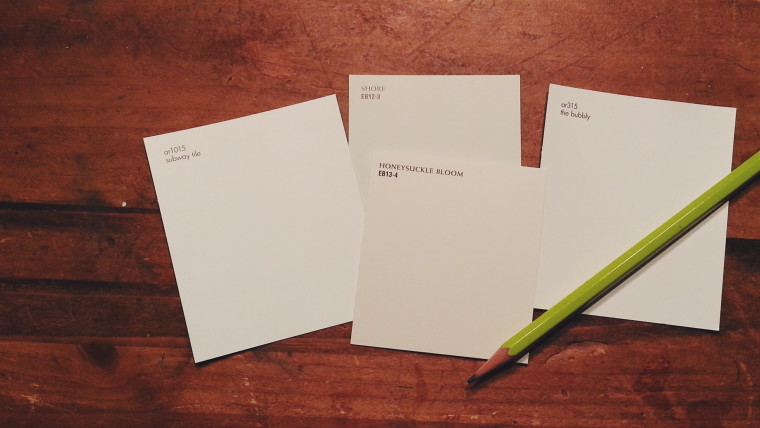
First things first – I headed to Lowes to pick up some paint….but I am having some struggles….how does one pick the perfect white?? I’d seriously like to know. I’ve ruled out really blue-y whites, and headed more towards warm whites. But could there be more choices?
I’ve narrowed it down, and I think I should pick ‘subway tile’ or ‘the bubbly’ — I can’t hardly tell the difference between them. Thoughts? Perhaps another favorite white?
Thanks for help.
-Rochelle

I go with my favorite colors to get the best white. I love ivory and I know if the formula has orange and brown I will like it. I do not care for whites with gray. My sister who lives in Alaska has a beautiful white dining room that shows pink tones in the morning and yellow in the evening. Beautiful!
Debbie – That is a great idea…I never really thought about looking at the formula.