Reds are tricky, and I find them the hardest color to work with in landscape design. I’ve fallen for the lure of a gorgeous red azalea sitting in front of the garden center, slammed the brakes, tossed it in reverse, planted the stupid thing, only to rage at it every time I see it along my own driveway.
Once it was in the compost pile, I felt much better. (this confession is genuinely making me wonder if I have a mental problem – is it normal for a color to have such an irritating impact on my psyche?) Conversely, why am I so drawn to this overwhelmingly red garden at the Flamingo Estate – enough to feel inspired to create this landscape design mood board?
What is it about red that is so complicated?
Even my phone finds red hard. Photos of red flowers never look the same in-camera as they do in my eye. It’s like two different colors – which leads me to conclude it must be all about the light and the shade.
To make red work, you need just the right shade and that shade must work in your unique light.
This in not untrue of other colors in any particular landscape – but red is the easiest one to get wrong. You know it when it’s good just as quick as you know it when it’s off.
Lipstick red azaleas in my front garden = bad.
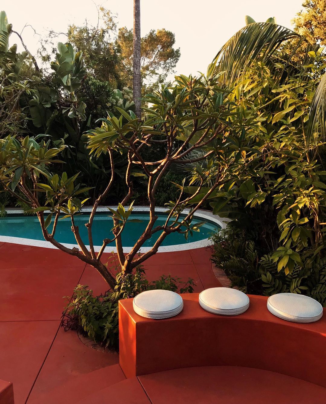
The clay-red decked pool deck at the Flamingo Estate in southern California = is good.
It works.
All the deep, sexy reds and luscious, earthy colors of the Flamingo Estate in LA inspired this collection mood board of garden design ideas and inspirations.
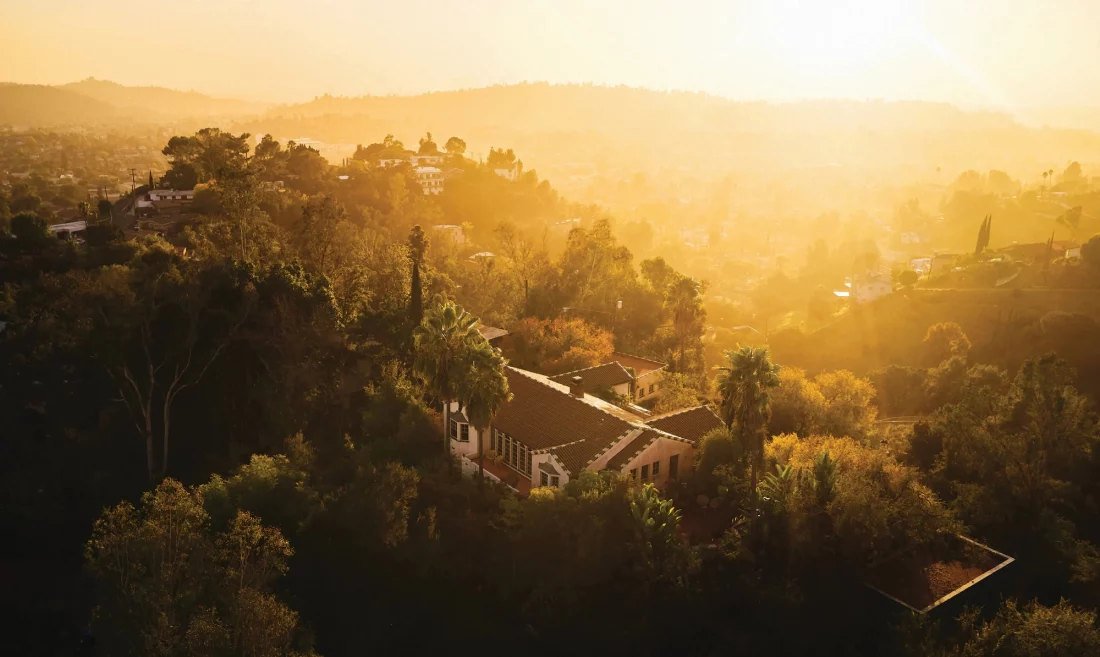
Located in the heart of Los Angeles, the Flamingo Estate is owned by Richard Christainsen who bought and renovated the 7-acre property through Covid. He made it a hub of locally sourced farm products and good living that are as inspiring as the property itself.
I was inspired to hear Richard talk on this monocle podcast about his approach and the project. (his heroes and favorite garden authors and mine are nearly 100% the same).
Inspired by the Flamingo Estate in Los Angeles
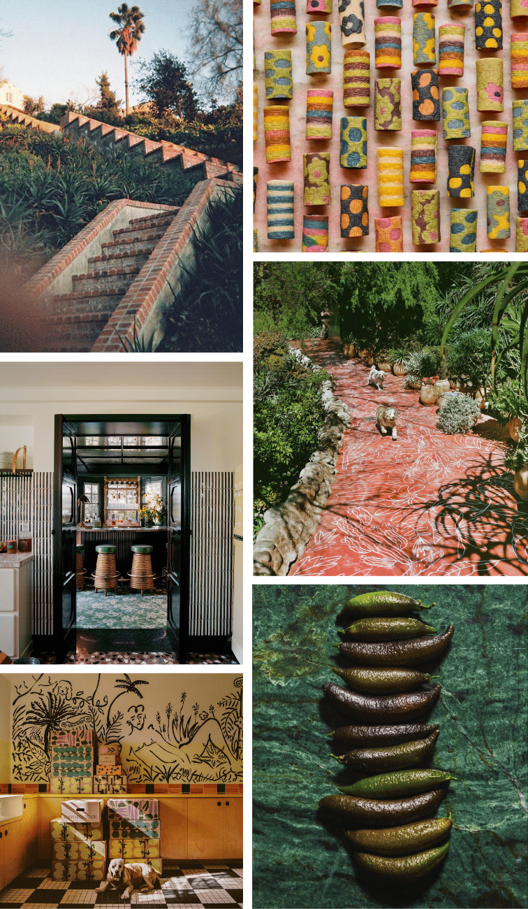
(start top left, clockwise): 1) Image from Flamingo Estate. 2) Mothers’s day pasta by @cookingwithfiona – made with Turmeric Root, Parsley, Spinach, Butterfly Pea Flowers, Hibiscus, Beets, and Harissa. 3) Chalk Drawings on red paths at the estate created by @abelmac. 4) Estate grown Finger limes. 5) If you are in Los Angeles, you can order produce deliveries from the estate. 6) Flamingo Estate by Francois Halard. (I’m obsessed with that black stripe tile!). Image via Chariish
Clay Red in Landscape and Design – a Garden Moodboard
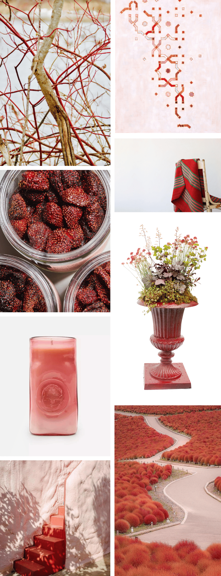
(start top left, clockwise) – 1) My favorite red in my own landscape (because it is entirely welcome and beautiful in the winter light of New England) is red twig dogwood (Cornus sericea). Learn about growing and foraging for your own Red twig dogwood stems. 2) Tile Paintings by John Squire. 3) Peruvian vintage frazadas (handwoven blankets for cool evenings on the patio) from @bontuscon. 4) The story behind this urn garden as well as how to create this container garden in the rouge urn. 5) Kochia (summer cypress) at Hitachi Seaside park in Ibaraki, Japan shot by @tkm82_ via @ignant_travel. 6) Red staricase in Carovigno, Italy, Courtesy of @margheritadibattista @pescetrullo found via @slowroads. 7) Purotu Hand blown glass rose candle from Liberty of London. 8) Harry’s Berries Spicy Strawberries.
How to do clay red in landscape design?
I’m not really sure of the answer, but for me, it is about time and place. There is a climate and a natural light that flatters red. And there is certainly a mood. I don’t live in that climate or light – and I only occasionally crave that mood. (actually, I take that back – my landscape design mood boards for an autumn garden in New England always feature earthy reds… but the light is lower and softer and there is also plenty of yellow to mellow it out).
Like it or not, red demands to be the center of attention. If it is in a garden, it will be the first thing to draw your eye. So if that isn’t what you want – don’t plant it or use it in your design. It is a beautiful color, but you must use it like you mean it.
Reds can be very emotive – and the just right shade can speak volumes. The wrong red conjures (in my mind) early 2000’s suburban dining rooms and an immediate desire to turn down a dinner party invite. It also can really piss me off (always unexpectedly and sometimes inexplicably). A glance upon certain reds, in certain contexts, can literally turn me from Jekyll to Hyde. It’s like “oh, please excuse my rudeness, I had a moment when glanced at that precisely-wrong-red wall you have over there”. (I’m not proud of this). Earthy clay reds work well outdoors as do deep burgundy reds and saturated pinky reds. I avoid clear hot reds like a werewolf avoids the moon – they are just too much for me.
Why does this garden design work?
That very top image by PJ Mattan is the best of red in garden design. The clay red surfaces works in its place (the So Cal landscape is full of natural reds). The brick edge detail reminds you that it is of the place. But even better, in this design, the red competes with little else. There is of course, the graphic white circle cushions (in a perfect threesome) and then the white repeats in the sensuous pool coping as well as in the subtle blooms in the trees (another prefect three-pete). Using red everywhere seems to invert its power and the bright white is given enough visual strength to balance the scene. With the exception of the contrasting shades of aqua and green in the water and planting there is nothing else but texture to complicate the view.
More Red design, Food, and Southern California Garden Inspiration
photography credits: Click images for links to their original source. In the case of my collages, the links are listed just below in clockwise order from left to right.
+comments+