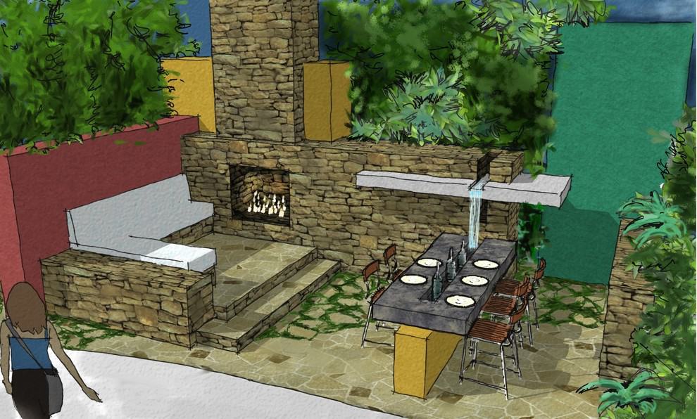
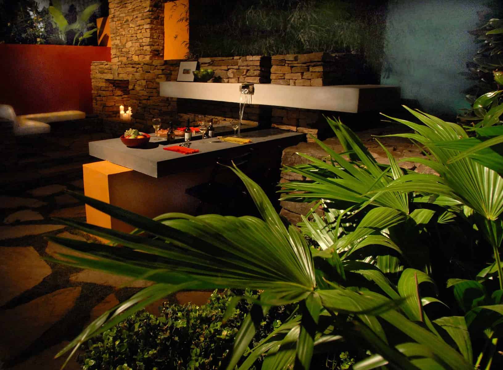
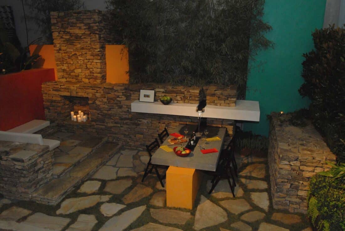
If you are looking for some great ideas to incorporate into a courtyard garden for a mid century modern home – this garden by Ted Cleary is full of great ideas. I really *really* want to jump right in and cozy up next to that garden fire with a glass of wine. It is a perfect small space design that feels like it could easily be adjacent to a Frank Lloyd Wright-inspired home. (Or here in New England, homes built by the ubiquitous Deck house company in the late 50’s and 60’s).
Ideas for a Mid Century Modern Courtyard Garden

It was designed by modern ‘Mad Men’ man and landscape architect Ted Cleary. Its retro vibe is certainly adding to its sex appeal, don’t you think?

There are lots of ideas to steal from this vintage-inspired garden. Here is my list of favorites:
1) Color Blocks can work in the Garden (Personally, I love the mustard, china blue, and terracotta block walls that break up the stonework and add color to an otherwise green expanse of planting )
2) It appears from the rendering that there was some thought about the spacing of the pavers in the corners. The idea seems to have been to have some areas of the ground stones have a wider spacing – allowing for planting between the paving, but other areas do not. The construction seems to be similarly varied.
When you observe these construction details closely in the actual build, this mismatch and lack of consistency (especially in the implementation) let the design down slightly. (why are the stones in the corner all jammed together in the corner with the stairs, and why do they have a different grout?) But It is worth pointing out that you can purposely alter the paving spacing to bridge from one area to another.
To soften a wide expanse of stone patio, it is common to space stone incrementally wider to blend into planting or a more open area of the garden. This takes away the need for a high-maintenance hard edge or line. I’ve never seen it done going into a corner (as the sketch would imply was the plan) – but it can be very effective as you move away from a tight corner.

3) Making built-in features work together is always inspiring. In this case, a mantel for the fireplace stone wall is also a water feature that pours onto the center of the table. It is clever, and the level of thought and planning that went into making the mantel-table water feature resulted in a garden that feels more luxurious.
4) The layout is very ‘open plan living’ inspired. I can almost see this layout inside a house just as easily as it sits outside. It has me thinking about taking layout inspiration from inside architecture.
What do you notice that sparks you?
That is pretty cool. Just think – wine and food near the lawn next to an open fire. Bliss.
This is my ideal!
what do you mean jim?
Goodness! I love this garden seating area, especially the water fall spilling onto the table.
This would be the ultimate design for me — had I the budget to carry it off. Fire, water, plants, table, bar, color, texture, sound, built-in sofa. Being an urban gardener it uses little space. All it needs is a sound system and an integrated spa and I’d never leave it. I want a gin & tonic there.