Want to see how this garden unlocked the many of the design secrets for integrating outdoor stairs with the natural surroundings?
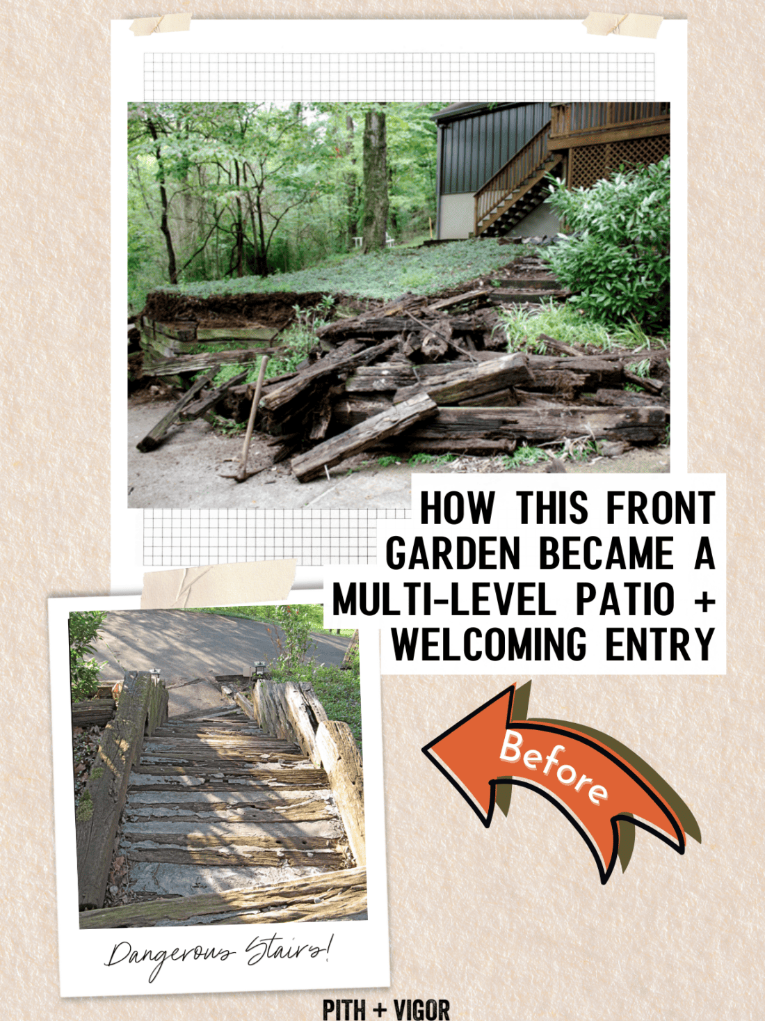
This Nashville house was a bit of a hot mess when Modfrugal bought it. Built in the 1970’s it had hardly been updated since. The whole house has undergone a complete re-do – but of course, we are focussing on the epic front deck garden and the inspiring and covetous tree house (which I’m personally sharing with my husband – maybe it can help him fix up our own treehouse?🙏).
Forced to replace the siding due to a complete infestation of critters that no amount of patching could dispatch, the new black metal siding really goes along way towards sprucing up the outside of the house.
But like all fix up projects, doing one thing makes all the adjacent things look 10x worse. Such is the case with the front entry garden.

Why this Outdoor Stairs Design Project works:
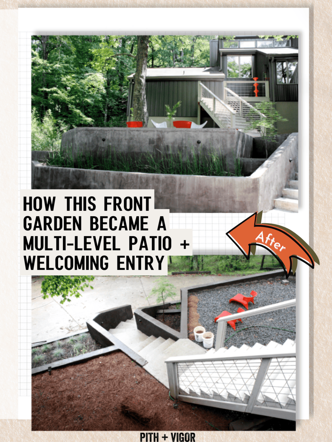
- The stairs aren’t all the same material. There are decking stairs and there are concrete steps. When you have this many steps (or this much of anything) it can quickly become too much. Breaking it up by giving sections a different materials treatment helps to keep something big (argueably too big) from becomeing so overhelming.
- The colors are well thought out. The deck stairs and the concrete stairs are a very similar color. They are different, but the same giving interest without being too chaotic. (there is alot going on here with the architecture, the steps and the retaining walls – it c ould easily go ff the rails and be a hot mess).
- The pops of red in the sculpture and chairs not only echo each other, but they give ou eyes a starting point to start taking in all the details. You always need to provide a good starting point.
- Each level is not too overwhelming.
- There is flow. The path to the front door is as welcoming as it can be given the circumstances. There are steps, then a resting pad, then more steps with plenty of space for a group at the front door. Nothing feel too precarious, tight or challenging.
The hardscape design changes I would make…
I understand why the concrete block walls were used on the lower section. They are surely more cost effective and longer lasting that some other options (i.e. a repeat of the wood that previously existed or natural stone). But, I think they are the weakest part of the design.
The look of the walls takes me out of the vernacular of this modern house set in the southern Tennesee woods and instead feels like a mix up with something that should be located in a more arid or warm place (it is the stucco/ plaster look that feels out of place with the place and the rest of the house). Finishing it with dark grey helps and brings together the whole mix of materials and colors but I think the whole things would be better if those walls were finished with natural and regional stone.
The choice to go with rendered blocks was most likely a cost based decision (which is totally understandable – we aren’t make of money and we can’t always afford the best, or everything we want). The good news is that this surface is a great base for adding stone veneer later.
Naturalistic Planting Design Options
The grassy planting is fine, but very predictable. This type of lined up miscanthus is the typical answer to a request for “modern” planting. But I find that my own preference would be to create the feel of modern with something that is a better foil for the architecture. I’d err towords something more natural – and with a texture and shape that contrasts with all the hard lines and angles of the stairs, walls and house construction.
Grass is straight and rigid, just like everything else – this doesn’t provide any interest. And I doen’st even really do the job of softening and settling the built elements into the setting.
Instead, I’d do a very simple mix of shrubs or perennials that were more round in shape and that have a softer focus.
One option would be Hypericum cistifolium or Hypericum prolificum – both are native shrubs (Woody St. Johns Wort). The have great structure – their woody branches get a reddish-mahogony color with interesting peeling bark. I’d underplant them with catmint (nepeta is not native but naturalized in the USA) for an easy planting that adds some color and pollinator interest.
For a look that doesn’t introduce alot of color, I’d swap the nepeta for Fountain grass (Pennisetum alopecuroides) which is not only native to Tennesee, but it is much softer and rounded in habit. It will flow over the top of the lower wall and make the whole scene a little less overwhelming with the walls.
A bulb layer could also be added to extend the season into the spring and I might also consider a collection of native asters to replace the nepeta and extend the season into the fall.

Design Notes for the Outdoor Stairs and Front yard Makeover:
- The Wooden section of stairs were widened, rebuit and fnished in a paint color that makes them stand out as a feature agains the back house. They have simple and modern railings and their new foot print provides a more direct and elegant sweeping path to the driveway below.
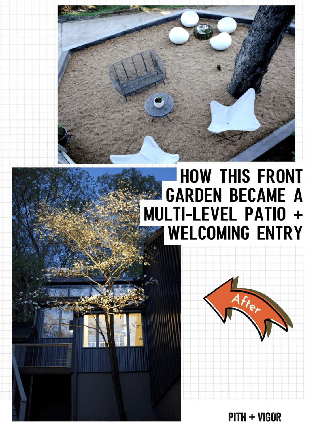
- The retaining walls were broken up. Instead of one large wall, multiple smaller walls were used to create a more manageable teired effect. Shorter walls are easier to build and require less engineering work to make sure they are stable and safe for the long term. The layers now provide built in planters, and a couple level areas that are now open patios for lounging.
- The large tree was maintained and you can see that the levels were designed around keeping that tree intact. Making an effort to retain trees and established landscape features (like mature trees) always makes sure that the finished project blends well with the existing landscape and doesn’t bear the scarred landscape look that many new build and reno projects tend to create (when the clear cut to make way for the new).

The tree house behind the big house
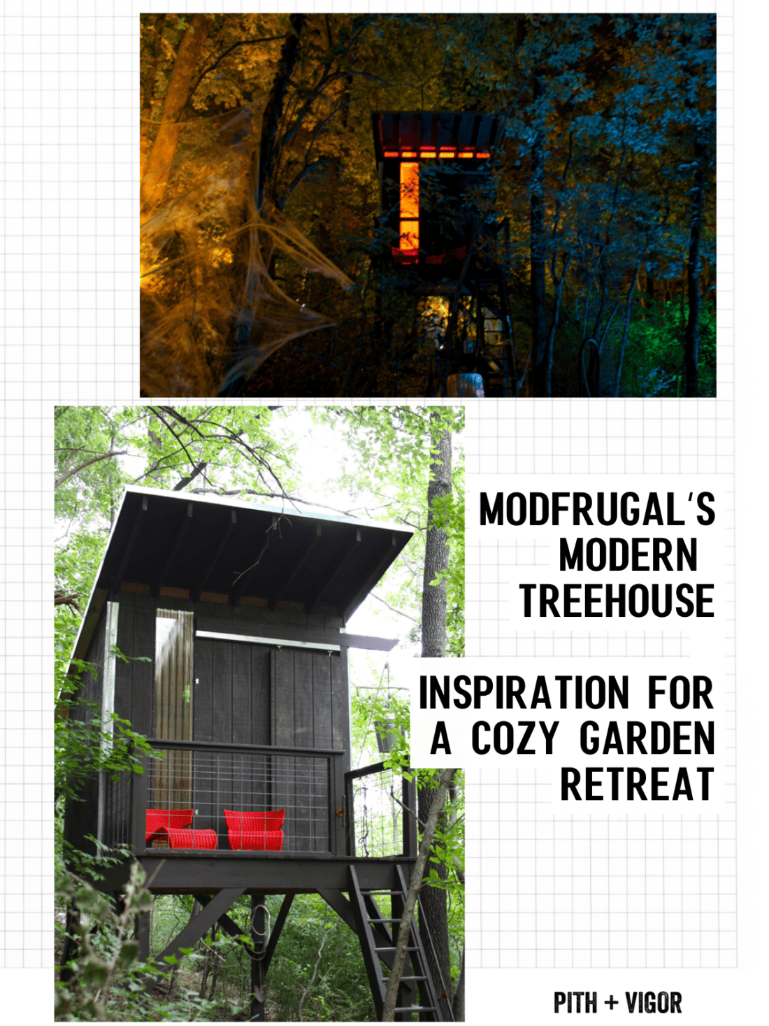
Tucked away and up the hill behind the main house is another equally charming and inspiring house – the modern treehouse.
Lit at night is a beacon of warmth in the woods. And during the day, the black building with the red chairs gives an equally striking invitation. The construction is fairly simple but the impact is huge. The architecture (a clean lined shed roof structure with sliding barn doors, skylights and what appears to be plexigass windows lets in light while keeping the building materials simple and relatively frugal.

Check out all the before images of this whole house project.
And you can take the full tour of the house and landscape after all the glow-up projects. It is amazing.
Side note: As you all know my house is black too. But before that it was very dark brown. My Ben Moore guy guy talked me out of painting my house black on a number of occasions (before I just did it) He said that it is too hard on the materials due to extreme heat. Turns out that isn’t a problem at my northern latitude and within my oak trees. But if you have the same concerns – I suspect that metal siding (like you see here) is a tougher and more efficient option to just black paint.
I love this before and after! I can’t wait till we can furnish our deck next spring….I’ve been scouring craigslist but haven’t found what I’m looking for yet.