When I first wrote this post (in 2013), images of Arthur Casas own home and garden in the french publication Planet Deco intrigued me. That was over 11 years ago and back then I wasn’t into spare modern architecture that features cube shapes. Nevertheless, at Arthur’s own Iproanga house, located near Sao Paulo Beach in Brazil, it was the stairs to his pool caught my eye. (I am still pondering their construction details). Revisiting Arthus Casas’ work – all this time later – I am inspired by many more landscape ideas that are part of the buildings and homes he designs.
Garden Ideas from The Design’s of Brazilian Architect Arthur Casas
Here are all the great garden ideas that caught my eye as I had a very enjoyable wander through Arthur’s Instagram and website.
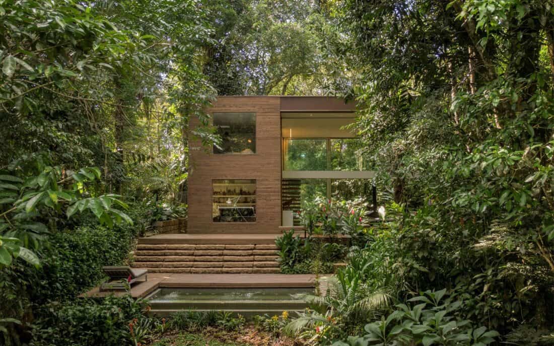
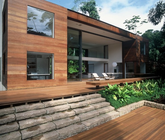
When I first laid eyes on this project, I’ll admit, I was lukewarm about the big square windows set into the rectangle box. But I am excited to see how the house has matured and settled into its landscape to become a place I enjoy. (see the early pictures below)
It is true, the photography is massively upgraded but the planting around the house has nicely softened everything making it feel far less sharp and cold.
Ahem…(The salability and marketing of your work as a designer is always best aided by someone who can capture it in its best light. Take good pictures of your work – hire a photographer if you can’t do it yourself).
But it was these stone stairs that caught my attention.
The Stone and Wood Stairs That Started My Arthur Casas Fandom
Designed by Arthur Casas Studio
Visually these wide steps feel like a visual reference to mayan temples and the contrast with the wood feels unexpected and interesting.
2004 images from planete-deco
Decking sits above the ground and is always set on a framework that is built on footings. This ability to hover over difficult or uneven terrain is precisely why it can be a handy material to work with.
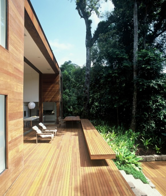
In this garden, decking is used to extend the main level of the house outside. And then again it is used to create a flat and comfortable surface around an inground pool. But in between – there are six steps that are constructed of stone. This isn’t something you see very often – at least not like this.
Here in New England (in the land of minimum 4’ft deep frost foundations), we tend to build stone steps on concrete or by stacking stone slabs upon each other. It is all very dense and solid. Because the construction, stone steps are typically flanked at least on one side by something equally dense and sturdy (like a foundation, or stone walls, or a stone patio) you don’t see this sort of sandwiching of materials.
I like the contrast of stone and wood and the curious positioning (of the stone). It makes me wonder exactly what the construction is under the stones and how they are being held for the long term. I like how there is a tiny bit of a shadow line where you can see that the stones are not quite resting on each other. It gives a sense of lightness you wouldn’t otherwise have.
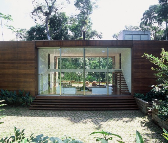
Arthur Casas’ Brazilian Home in the Jungle.
The house is transparent from front to back. Wide steps rise to the main level from outside on both sides of the house and open areas of decking and paving keep the Atlantic forest jungle landscape rom encroaching on the building.
The Low Cantilevered Patio with a shallow pool.
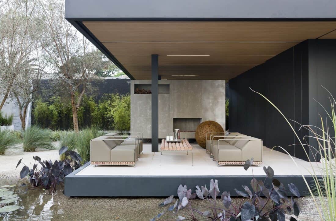
In Arthur Casas Syshaus project, he creates a low patio that is just one step up and elevated over a very shallow gravel filled pond. In a warm climate, this feels like a refreshing alternative to a pool or a more extensive pond. Plus there are nice opportunities to plant a few purple leaved colocasia (perhaps Colocasia Black Magic?).
Vertical Color and Texture blocking (on Buildings)
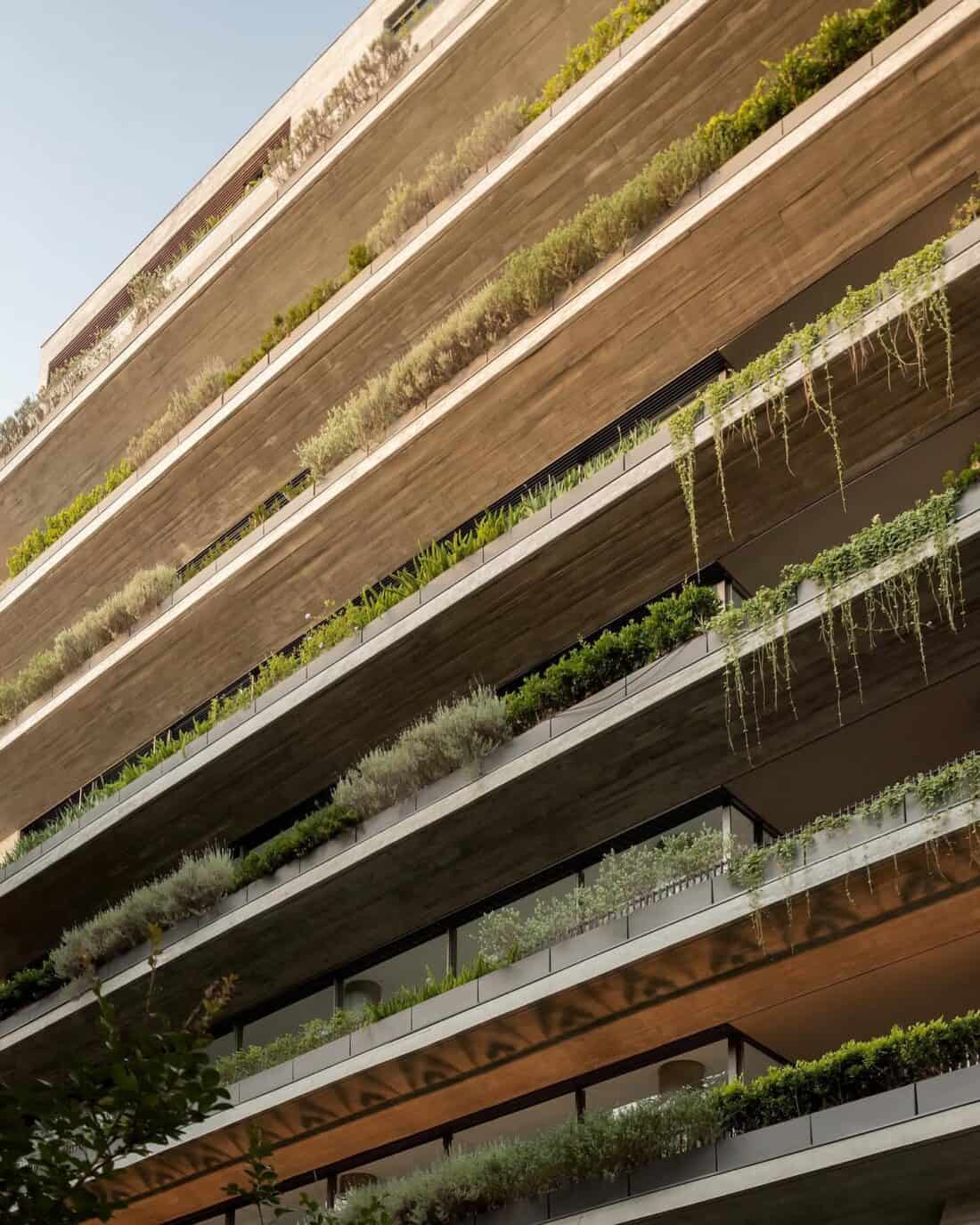
Green buildings or more specifically, buildings with lots of planting built into their facades are increasingly common in temperate regions (I wish we could have more of them in Boston!).
I love how the tenets of good planting design (contrasting color, texture, and shape) work just as well in a vertical series of planters as they do in the ground on the horizontal plane. But when you mix in architecture, you can also make it extra appealing with clean stripes of structural layers.
The Low House Rooftop and Tree Top Garden
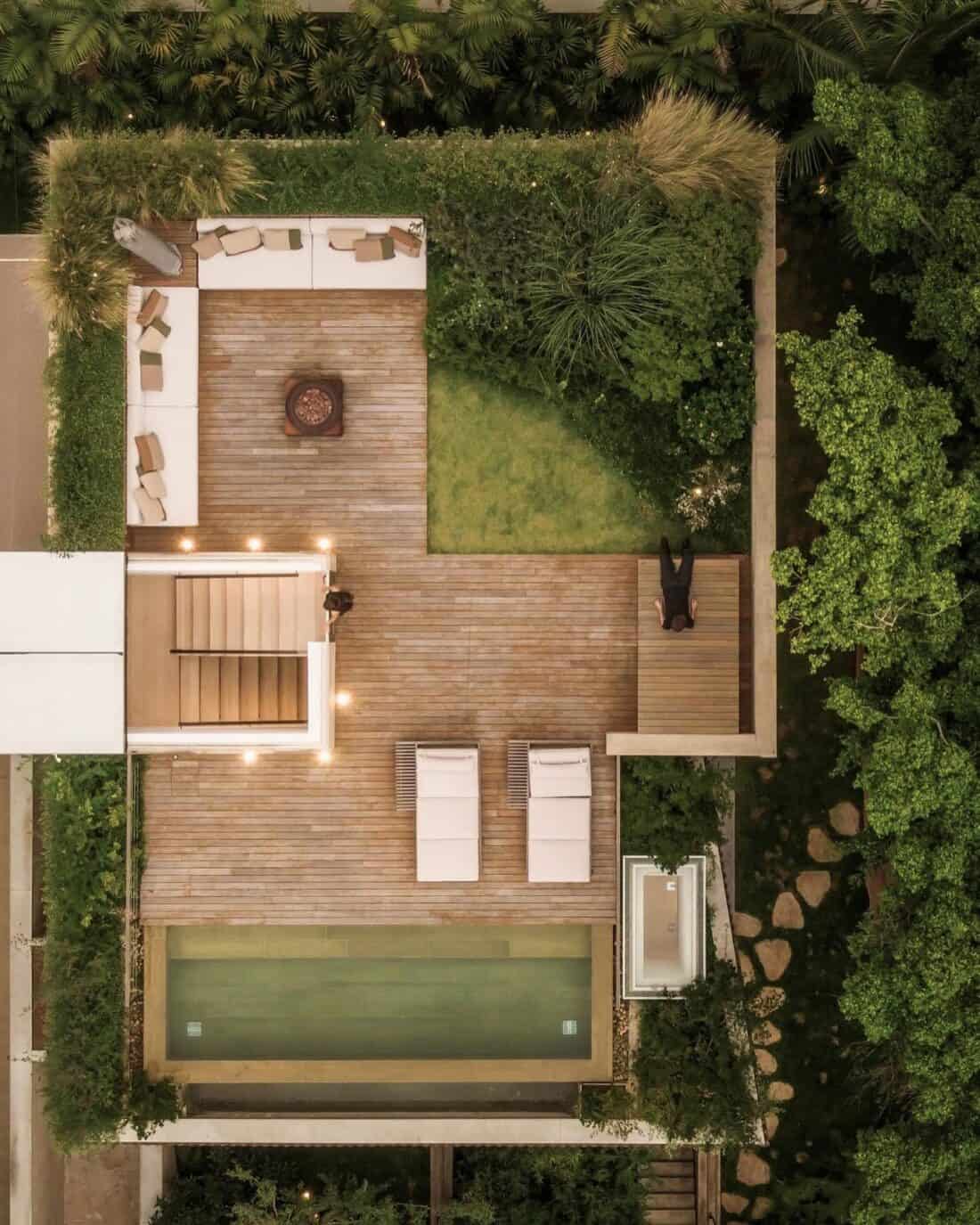
It strikes me that as we globally consider how we can better design our communities, transport, and the built world, to reduce our negative impacts on our climate we will increasingly rely on density as an alternative to sprawl.
And density means figuring ut how to live in a that still lets us have our much needed outdoor spaces.
This project is notably five stories tall but you can see from he arial view that many of the in ground trees planted around the building are at such a height that their tops really can be considered in the feel and design of the rooftop garden.
I love creating future gardens where things are planted on entirely different planes. It seems like it creates a fun opportunity to interact with different parts of plants (like the rooftops of trees!).
The Unique Details of Design Always Matter
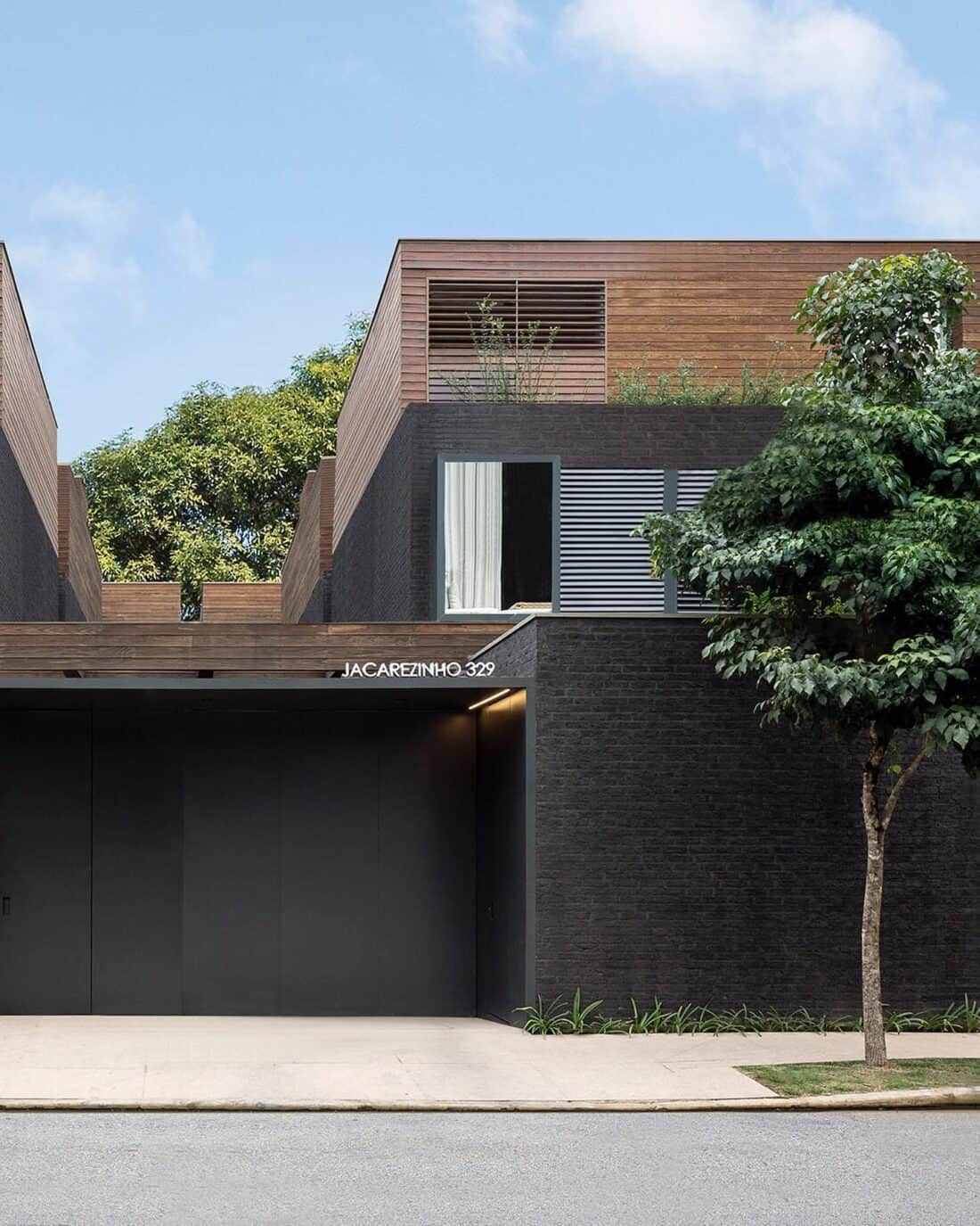
When I was in Mexico last summer, one of my favorite things about the house we rented for the week was one of the smallest details. The name of the complex, written in a modern cursive font and created with wrought iron was mounted on front of the building. Not unlike this building where the street name is included with the house number.
I find just the little bit of extra to be a design touch that makes a home or a building stand out. It is just a word or two – but there is an opportunity to pick a font, and a material and color and when done well, those details upgrade everything.
Perhaps there will be a trend towards this – to include building names on more buildings. To give them a personality more than just a number? I’d be in.
Arthur Casas Does Texture Very Well
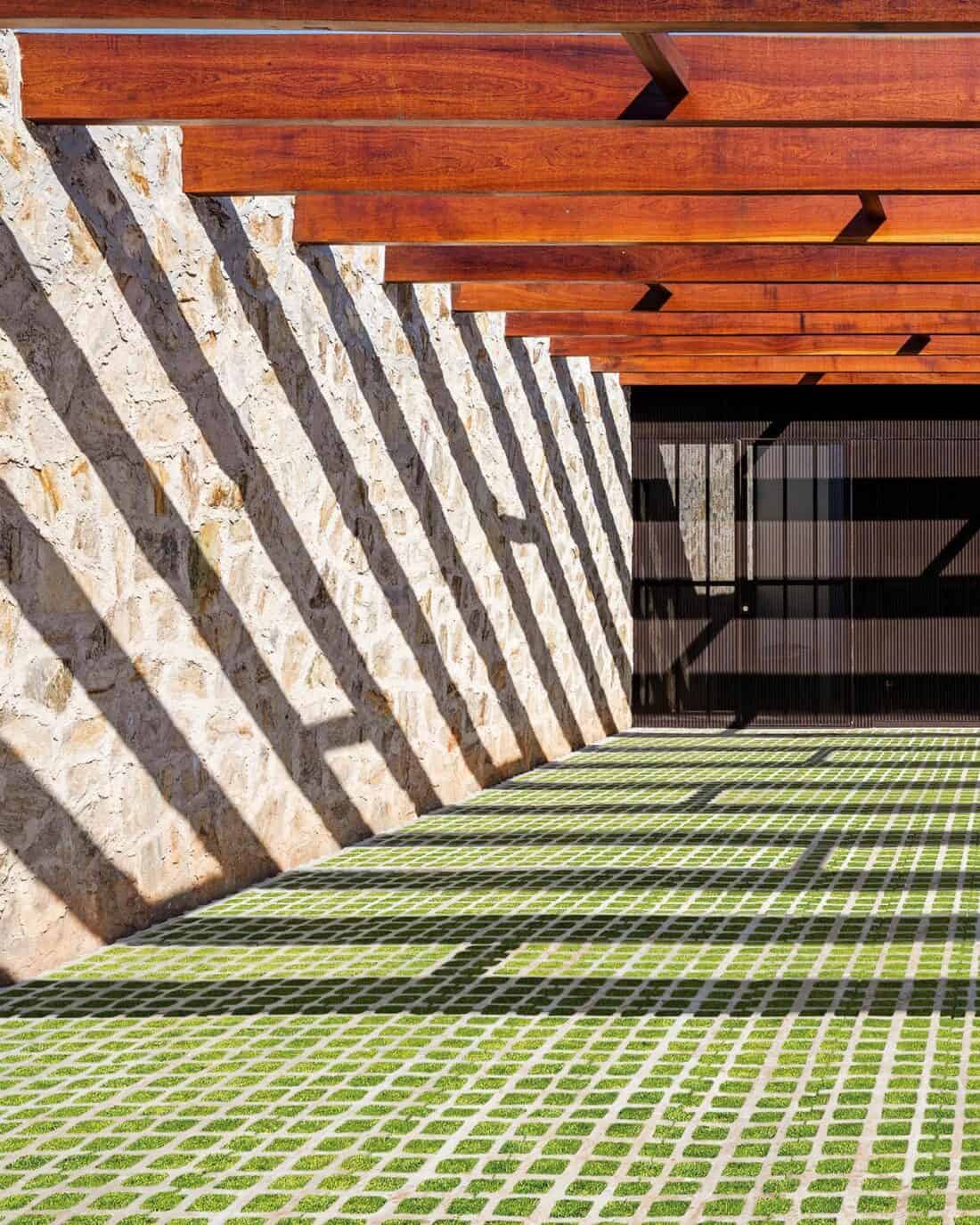
Across all the lovely projects that are in Arthur Casas’ profolio, it is clear one of his best design tricks is to elegantly use texture and pattern to create beautiful buildings that are modern and simple and anything but boring.
It is a lesson to any designer in how to use resraint but also keep amping up the interest.
Long live the Breeze Blocks!
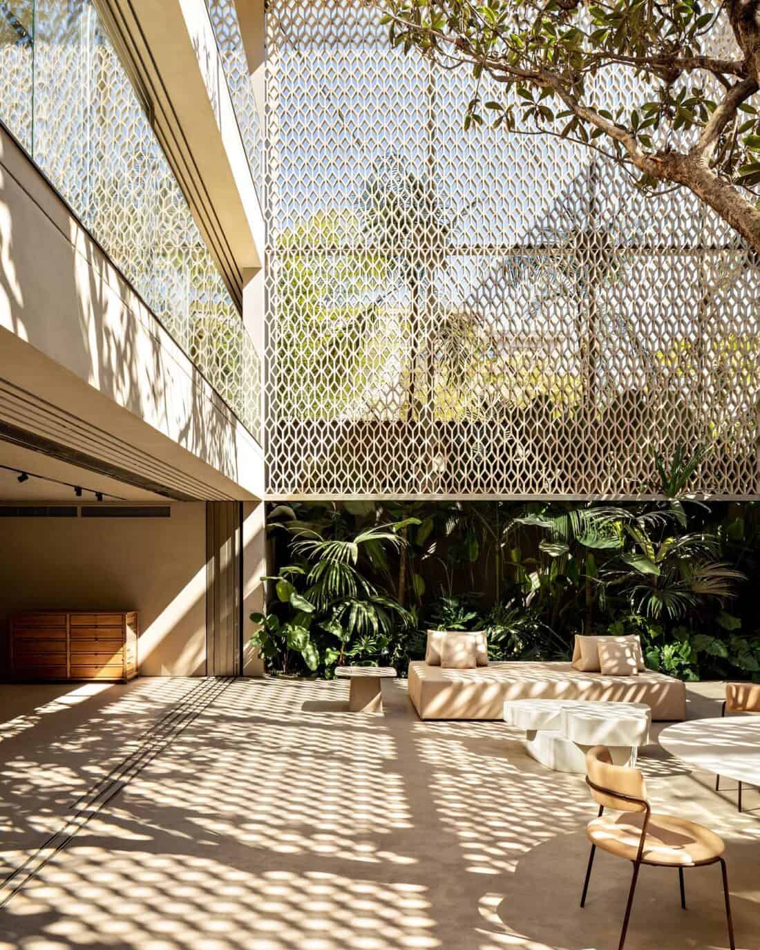
As a pattern lover, I wish I lived in a place where breeze blocks are smart for creating open indoor/ outdoor spaces. I love that kind of living and often wish New England allowed for more of it.
If you live in a mild or warm climate, breeze blocks can provide partial privacy (especially outdoors) and perform as load-bearing walls. They are great for allowing ventilation and protection from the sun, not to mention lots of opportunities for added details and interest. I wish they didn’t look so weird next to New England Architecture (definitely not in the spirit of this place). But I do think that there is room for taking inspiration from some of these designs and maybe adding more patterns and interest to our outdoor living spaces.
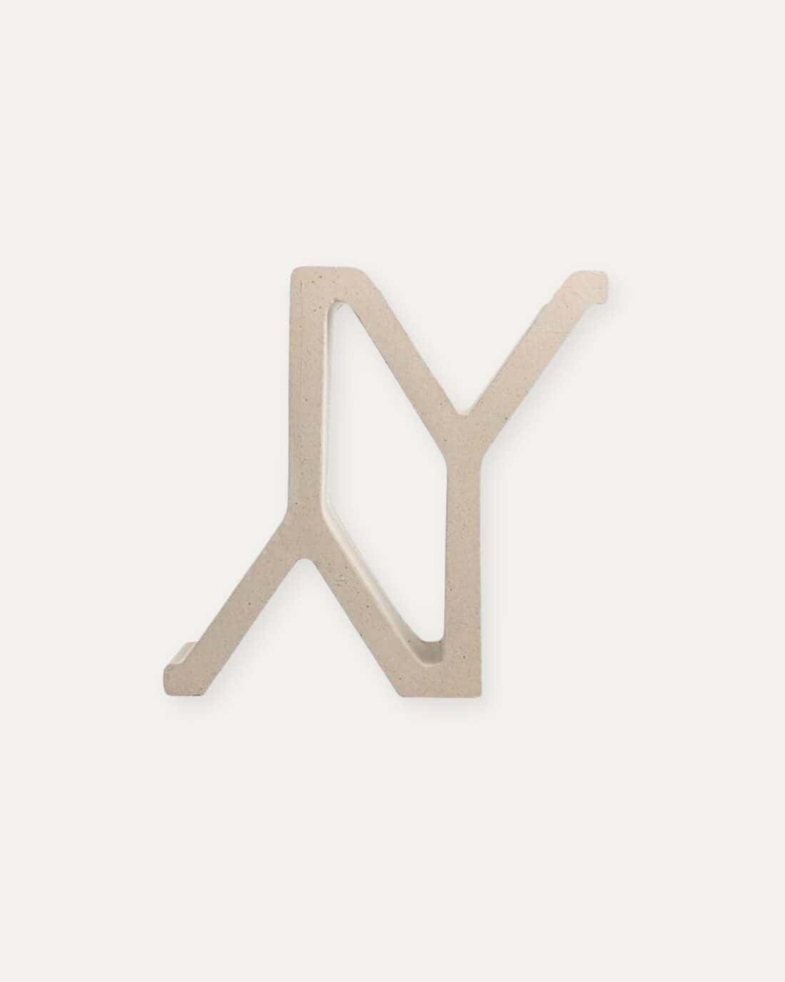
If it does make sense to use breeze blocks where you live, it is worth it worth checking out Arthur Casas Design Studio website. I am not entirely clear if some of his designs are available or if he is just sharing them to show your how interesting blocks can create fascinating patterns. This Instagram post is particularly inspiring.
+comments+