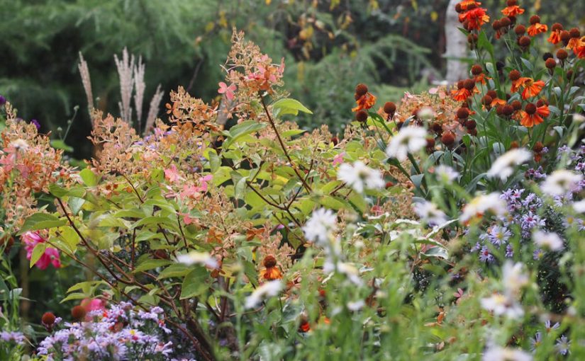
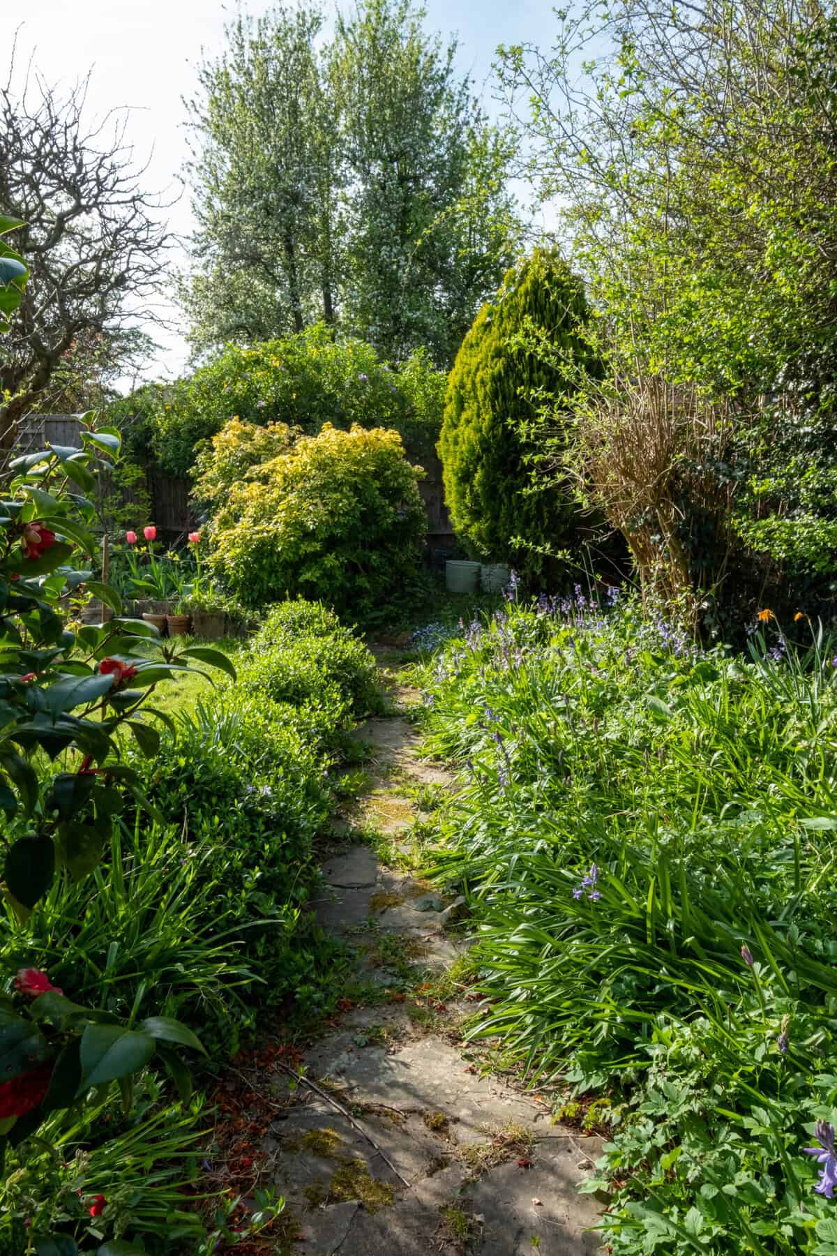
Naturalistic and Matrix Planting Design
Dive into
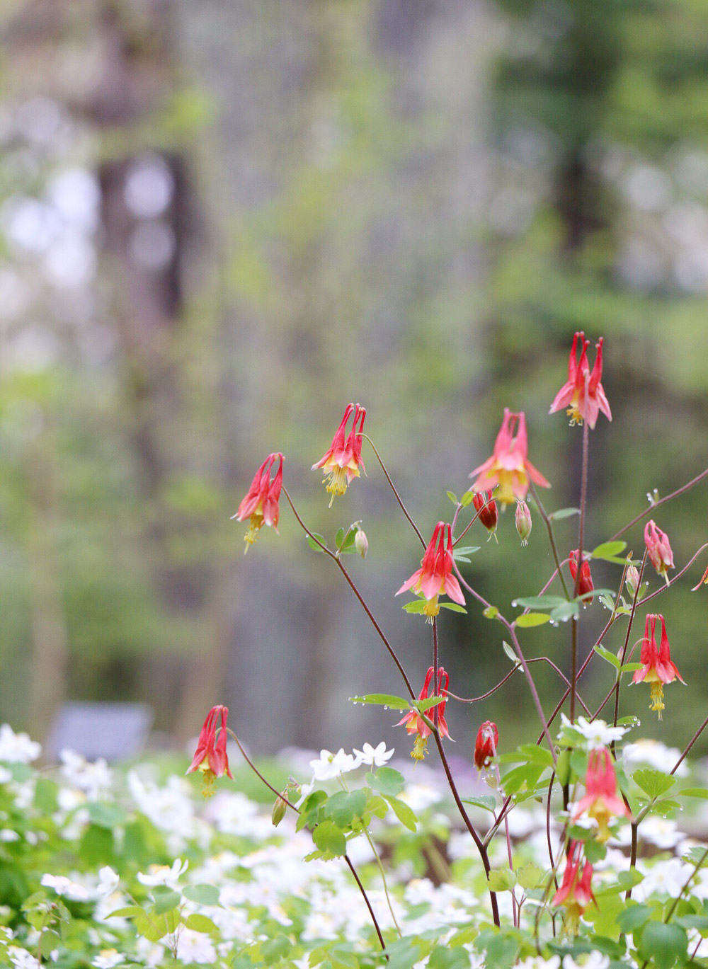
More Native Plants and Natural Planting Design Help
Garden design BASICS
Get Started With:

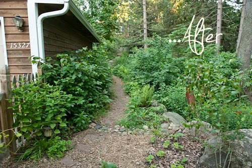
Does Your Garden Need a Makeover?
Learn my 7-step system to design and build a stunning garden anywhere in the world.
SIGN ME UP!
Join my Free Class!
Understand the 5 mistakes everyone makes when creating a garden. (Save yourself time, money, & headaches and get much better results!)
See how to work directly with me (but at a DIY price!) to
design and create your own gorgeous garden.